This is an infographic narrative execution of Francis Ford Coppola's film Apocalypse Now.
It details Captain Willard's journey to meet Colonel Kurtz. Done for no other reason than the pleasure...
-
 View projectIn this period of overseas planning, the members of "The Infinite Challenge" received applications from all over the world , and some of them are selected for distribution. This process diagram is...
 -
 View projectEmotion Park is an experimental data visualization project to see how well machines can analyze song lyrics. The visualization tries to capture the emotion of the song lyrics in the form of a...
 -
 View projectLata Mangeshkar is Bollywood's most prolific playback singer. In a career spanning 73 years, she recorded at least 5,401 songs. For Lata's 87th birthday, Hindustan Times made an interactive data...
 -
 View projectOne of the things that make Berghain amazing is the great artists curation. I find myself going to Berghain's website and looking at the listings just to discover great techno and house music...
 -
 View projectIn my younger days, I used to eat fast food all of the time. So cheap. So delicious. But these days, it’s all about moderation. My metabolism no longer supports the same amount of fried food. The...
 -
 View projectWe looked through decades of rap lyrics and categorized every mention of Donald Trump and other presidential candidates, and presented the results with graphics, sound and an interactive database.
 -
 View projectInspired by Fotis Kangelaris' collection of masks from all over the world, the work "WORLD MASK NEURON" presents distinct approaches of art as depicted by Natalia Stamopoulou. The digital masks...
 -
 View projectChristopher Nolan`s Thriller Memento deals with a man who suffers from a short-term memory loss, an alleged murder and the nature of the crime. Furthermore the component of vengeance is addressed....
 -
 View projectLanguage has two aspects - sound and meaning, and yet we don't tend to care about sound as much as we care about its meaning when using language. This project attempts to draw attention to sound...
 -
 View projectWhen a story is well-written, you can become so immersed while reading that it becomes your world. All your surroundings disappear and all that remains are the words on the page guiding you through...
 -
 View projectBernwood & Steinward used data that have been gathered by the fantastic fan website u2gigs.com. This fan collective has collected all the data of U2 shows from the early years until the most...
 -
 View projectThis is a set of Internet infographics about the city of Donostia-San Sebastián. It represents a route of 6 kilometers along the coast of the city. It provides information on points of interest in...
 -
 View projectThis visualization attempts to tell the story of film. An epic journey of innovation across 14 decades, 137 countries, and 4,070,420 films.
 -
 View projectWhat three years and 75,000 shows in New York tell us about the chance your favorite band will succeed.
 -
 View projectIt started with The Sex Pistols. Specifically, with The Sex Pistols’ June 4, 1976 show at the Lesser Free Trade Hall in Manchester, England. The concert now ranks as one of the most influential...
 -
 View projectSeparately, we looked at marrying age, divorce rates, and those who never married. Now let’s look at marital status all together, with the addition of the widowed status. As you switch between...
 -
 View projectThe American Time Use Survey is an ongoing program from the Bureau of Labor Statistics that asks thousands of people, as you might guess, what they did during the last 24 hours. Using the data...
 -
 View projectOlder people are inclined to accuse younger ones of spending all their time in front of screens. Actually, those in their 60s are as guilty as those in their teens – and the amount of time that all...
 -
 View projectCreated for a Cannes Lions panel—where Adam Bly, Spotify's VP Data, interviewed burlesque performer Dita Von Teese—this visualization shows how your music streaming habits offer a window into who...
 -
 View projectThe 'interactive Elvis Presley Jukebox' is a visual analysis of the tempo of close to 400 Elvis Presley songs. Each facial grid is a song. A brighter blue indicates a faster tempo & a lighter...
 -
 View projectPatterns in Fantasy book titles Fantasy books are a wonderful genre within literature. With their brick sized formats and series spanning a dozen books or more, many amazing worlds, very different...
 -
 View projectThangka is the unique fabric-painting art of Tibet, and few modern people know the origins and production processes of Thangka. I used the form of the temple city to explain the production process...
 -
 View projectArtwork for Visual Data, the column on "La Lettura", the cultural supplement of "Corriere Della Sera". In collaboration with Institute of computational linguistics "Antonio Zampolli" and ItaliaNLP...
 -
 View projectCheers to our rich history, diverse culture and impeccable craftsmanship- all being our ultimate sources of inspiration! GENERATION's CLASSIC and COTTAGE are perhaps the only product lines that...
 -
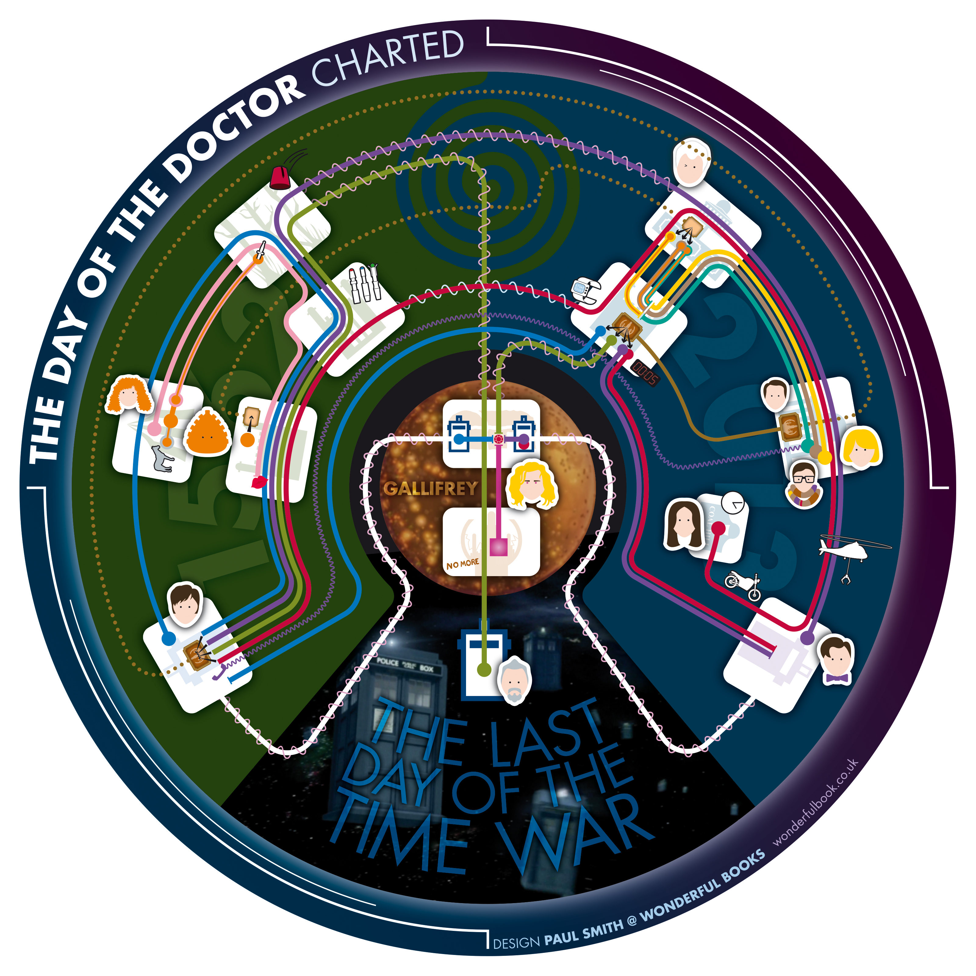
 View projectInterviewed in Doctor Who Magazine in 2016, series showrunner Steven Moffat talked about the difficulties of writing the 50th anniversary special 'The Day of the Doctor' in 2013. He was not only...
 -
 View projectThis pop culture visualization explores all spells used in the 7 Harry Potter books. Hovering over a spell reveals the spell's context and other details.
 -
 View projectAnna Karenina has one of the greatest opening lines in all of literature: "Happy families are all alike; every unhappy family is unhappy in its own way." This project investigates the connection...
 -
 View projectOnly self-supporting statues are profiled in this graphic. Statues carved on rocks and mountains or those under construction are not included. You may want to try resizing the browser window