Video: https://youtu.be/IDNCBtOuTkc
Data: MapTiler
#MapboxGL #maps #3D #buildings #ThreeJS #maptheclouds #WebGL #nyc #manhattan #maptheclouds #travel #cartography #arts #perspective #cityview...
-
 View projectPart 4 of The Bat Lands. The Amazon, one of the most bat-diverse regions in the world, is under constant assault from deforestation yet no widespread viral outbreak has been documented there....
 -
 View project"But what about protein?" is perhaps one of the most frequently asked questions to vegetarians. The doubt arises from the simple view - surrounded by problems - that meat and eggs are the main...
 -
 View projectOpenFlights Airports Database contains over 10,000 airports, train stations and ferry terminals spanning the globe. Feel free to query all airports on this map. Video:...
 -
 View projectConfusion matrix - in a way that is friendly to a non-technical audience (interactive, without VBA) Confusion matrix is a decision-making tool, that helps us to solve classification problems in...
 -
 View projectA #ProjectHealthViz submission by Shreya Arya. Interact with this visualisation to learn more about Endometriosis, how it impacts women physically and emotionally and the influence the condition...
 -
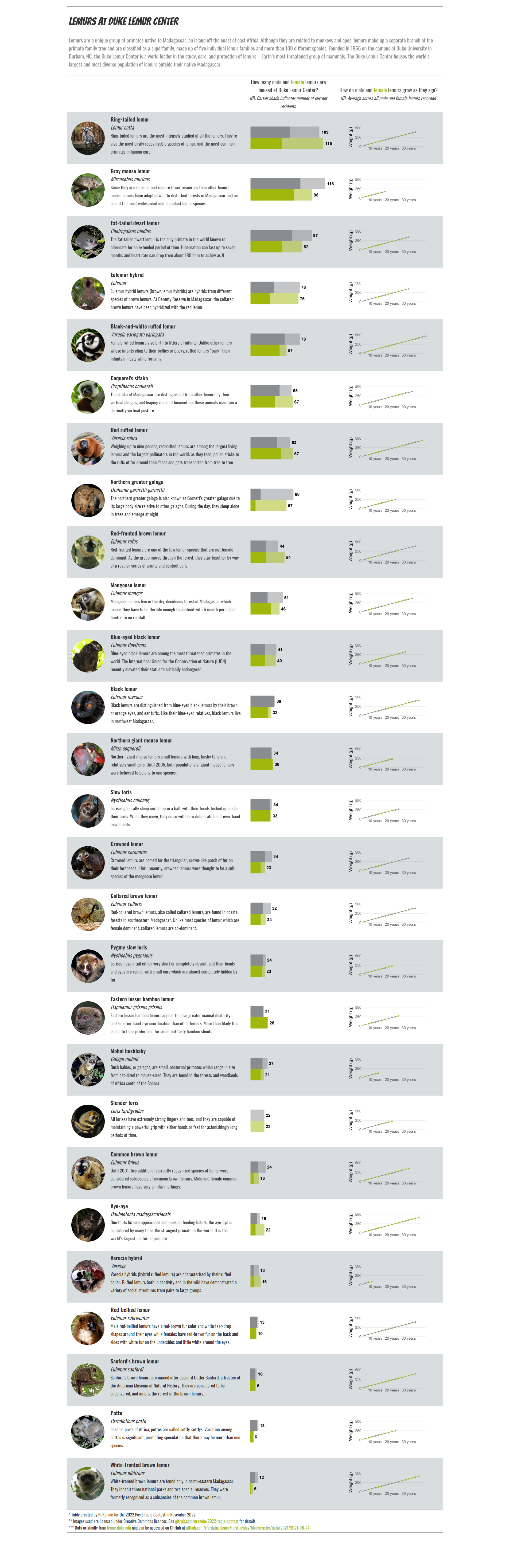
 View projectDuke Lemur Center houses several hundred lemurs, many of them endangered species. This table explores of 27 of the species of lemur that have been housed there, showing the number of males and...
 -
 View projectPeCan Knowledge Base: Making sense of complex genomics PeCan Knowledge Base (PeCan) on St. Jude Cloud (part of St. Jude Children’s Research Hospital) is a pioneering resource that began as a...
 -
 View projectAs a key figure in the IPCC Synthesis Report, Figure SPM1, panel c, captured global media attention and inspired many related visualizations. Figure SPM1c breaks new ground for IPCC as it ties...
 -
 View projectIn May, the World Health Organization asked the Viz for Social Good community to help them visualise what disability looks like across the globe through a digitally accessible lens. Leveraging...
 -
 View projectThe allure of the Moon's mysteries has swept across the globe, captivating hearts and minds. Inspired by a renowned melody, I embarked on crafting an exquisite infographic. Drawing upon the elegant...
 -
 View projectToxic levels of air pollution contribute to serious health complications and premature deaths. In the UK, the legal level of air pollution (measured by PM 2.5*) is currently 20µg/m3, with...
 -
 View projectGSK believes that innovation starts when we stop to listen. This generative data visualisation aims to start the conversation about the future of health innovation by providing an immersive and...
 -
 View projectConsider the accessibility and inclusiveness of the internet, by examining the internet speed performance. How long it takes to transfer 100MB, in the ten countries with the fastest and slowest...
 -
 View projectSpace debris poses a threat to both satellites and future space missions. The littering of space with defunct satellites and old rockets has accelerated dramatically these last years, mainly due to...
 -
 View projectMerck can trace its roots all the way back to the seventeenth century when Friedrich Jacob Merck opened up shop as an apothecary in a small city in what is today southern Germany. After the...
 -
 View projectAs young researchers, we all strive to aim high in our careers. But how high may we plan? This project was born out of curiosity to see what statistics say about our chances to be published in...
 -
 View projectAs the globe swelters under hotter and hotter temperatures, the simple surfaces around us can become a threat to human health. This piece explains the danger surfaces exposed to extreme heat pose,...
 -
 View projectIn June 2023 the sky over New York City turned dark red. In this graphic analysis, we show why dust clouds cover one of the largest cities in the world.
 -
 View projectToronto-area schools provide vaccination rates for the Diphtheria-Tetanus-Pertussis (DTP) vaccine. The Toronto Public Health staff work with schools to show that students have either been...
 -
 View projectLiquid Gold was built for this year’s World Breastfeeding Week. World Breastfeeding Week runs annually in August and is designed to bring awareness to breastfeeding and its benefits and the...
 -
 View projectIn the wake of the rapid advancements of AI technologies and multiple reports of their issues, regulation efforts are currently catching up. Hence, I wanted to visualize the current progress of...
 -
 View projectThe Gender Diamond and Gender Flower are two interactive visualizations of the gender spectrum that suggest a mathematical datafication of nonconforming gender identities and sexualities. With...
 -
 View projectWhen Tutankhamun died, objects specially crafted for the burial and heirlooms from his predecessors went with him to the grave. All were believed to accompany the pharaoh to a comfortable...
 -
 View projectClimate change poses many risks to human health one of which is increased risk of infections. This poster presents data linking climate change to viral infections. As a researcher I was keen to...
 -
 View projectWeanalyseadatasetof100documentsonAIethicsissuedbyvariousorganizationsbetween2015and2022.TheaimofthisanalysisistoprovideacomprehensiveviewofthecurrentAIethicallandscape.Weusecontentanalysistohighlig...
 -
 View projectIn August 2022, the White House Office of Science and Technology Policy (OSTP) released a memo regarding public access to federally funded research articles. This website hosts interactive versions...
 -
 View projectA healthcare analysis dashboard of select sample data of California hospitals covering Utilization, Hospital Analysis, Inventory, and Rating. I worked to find public and sample data that could be...
 -
 View projectLinear algebra and matrix computations are often presented in math class as an array of inane formulas and calculations to drill and memorize. This explorable explainer attempts to present a deeper...