Rising deductibles and out-of-pocket costs are increasingly leaving patients responsible for bloated medical bills. A new analysis by Johns Hopkins University reveals that many of the top 100...
-
 View projectThis map was a personal project where I wanted to see what were the correlation or attributes to pancreatic cancer. With this approach, an observer can get a sense of various factors. Does age...
 -
 View projectPageRank Algorithm Visualization is a project with the aim to make visible and comprehensible the functioning of “Page Rank”, ex Google’s algorithm. A 2D poster game interactive visualization to...
 -
 View projectThe interactive scientific poster "Explore The Ocean" of the GEOMAR Helmholtz Centre for Marine Research explains complex marine science with a multi-touch display right on board the Hapag-Lloyd...
 -
 View projectInformation visualization for La Lettura, Il Corriere della Sera Date of publication: 29|04|18 The visualization shows an overview of the cryptocurrencies market in April 2018. It relates...
 -
 View projectFor at least 9,000 years agaves have been an integral part of Mesoamerican culture, identity, and tradition, supporting rural communities and healthy ecosystems. In Mexico today, intensive farming...
 -
 View projectStar Trek version 😀 Video: https://youtu.be/hZWyB-hYJC0 Data: NOAA National Geophysical Data Center. 2009: ETOPO1 1 Arc-Minute Global Relief Model. NOAA National Centers for Environmental...
 -
 View projectThese three information charts describe the morphological characteristics, growth and development of fern, gymnosperms and angiosperms, and their respective information. I have illustrated each of...
 -
 View projectPart 2 of The Bat Lands. First it jumped from bats to pigs. Then pigs gave it to people. Now the brain-damaging Nipah virus has found a way to leap from bats to humans without an intermediary host....
 -
 View projectA web interactive Stop Motion animation of 1380 handmade vector illustrations about the Apollo 11 mission to the moon, containing explanations, original dialogues, interesting facts, doubts and...
 -
 View projectHow will »prompting« change the way we experience the world? Artificial Worldviews inquired GPT-3.5 about its knowledge of the world in 1.764 prompts and mapped out the results. The advent of...
 -
 View projectA comic drawing attention to the fact that having more ways of contacting people doesn't necessarily make it easier to contact people.
 -
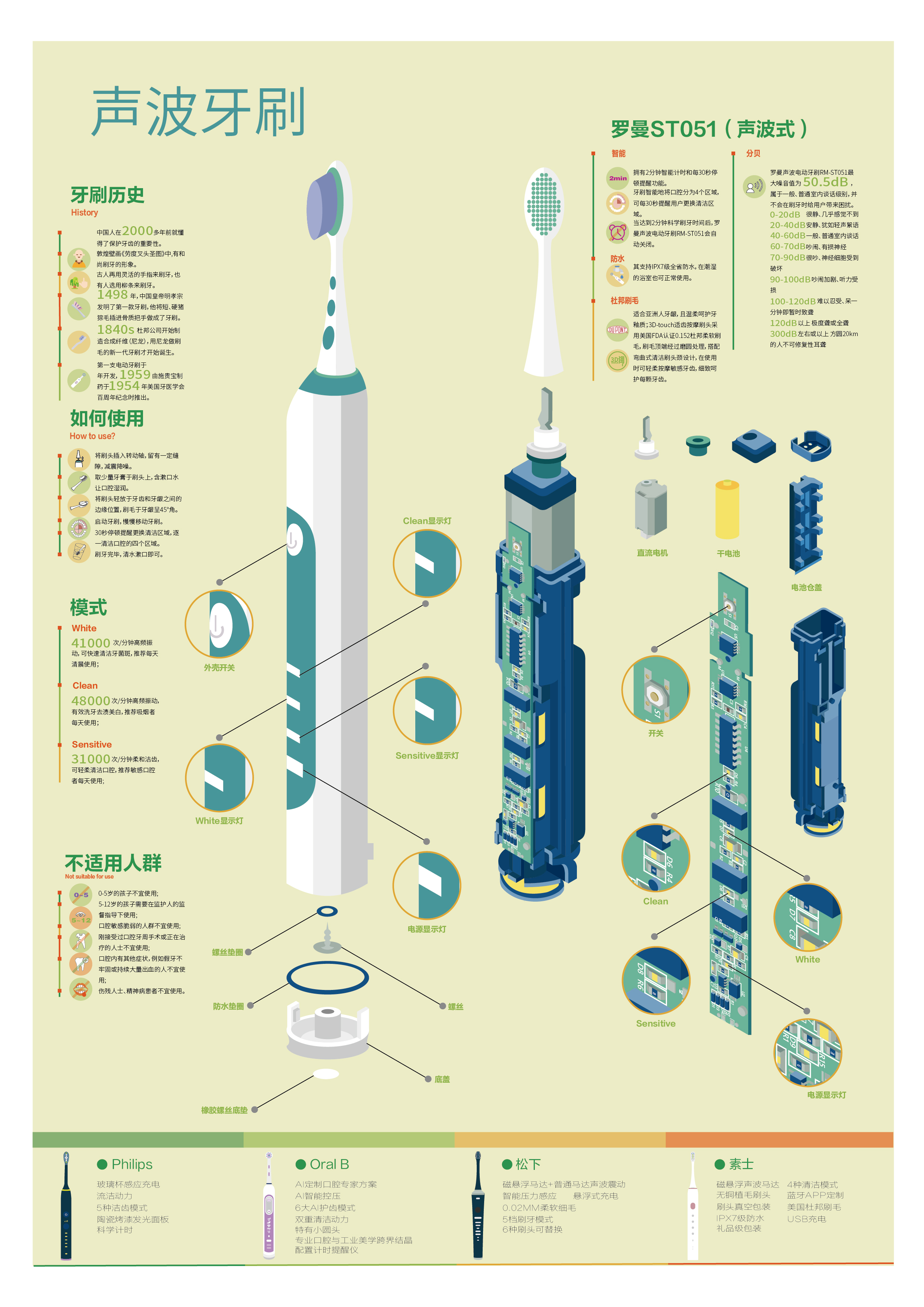
 View projectThis is an infographic introducing the Roman ST051 sonic toothbrush, which interspersed with some knowledge about electric toothbrushes.
 -
 View projectThe dashboard serves to illustrate the trends and attributes of blood donor activity in Malaysia. The availability of an ample supply of blood is of importance for the efficient functioning of the...
 -
View projectThis is a visualization of unicorn companies (companies with a valuation of over $1 Billion USD. This visualization demonstrates the sharp increase in the number of unicorns in recent years. This...
-
 View projectThe increased industrialization of farm animals has not only affected the number of animals processed every year, but has also had immense environmental effects on the air, land, and water of the...
 -
 View projectAs the amount of personal data held by governments and companies continues to grow, the personal and systemic cost of not securing this information properly also mounts. ABC News Story Lab...
 -
 View projectHow can we measure the impact of the most important scientists on our society? Many factors can be considered: industrial applications, scientific prizes, etc. One of them is the analysis of their...
 -
 View projectLab24, the visual area of Il Sole 24 Ore, has published “La Guerra dei chip”, a longform that explains why semiconductors are the most valuable and disputed piece of technology today, with analysis...
 -
 View projectMigratory birds have made their thousand-mile flights for milennia, but we are just now learning to map their mesmerizing journeys.
 -
 View projectAn interactive essay that walks a reader through the process of building a histogram, from an unordered clump of values to the finished chart. The essay highlights how parameter choices throughout...
 -
 View projectHow a piece of trash can travel from land to Henderson Island, an uninhabited, remote island in the middle of the South Pacific Ocean.
 -
 View projectThe scientists at the Amboseli Trust for Elephant have studied the same population of elephants since 1972. They know most individuals by name, as well as their genealogy. We built this...
 -
 View projectThere's a good chance you experienced an earthquake today. Every day there are hundreds of thousands of earthquakes all over the world, except most are so small they are never felt. But what...
 -
 View projectThis visual, created by a cross-functional team across EVERSANA, is a dashboard constructed in tableau that comprises dozens of sheets that have been assembled to provide an audience a complete...
 -
 View projectLand animals have developed countless solutions to a single challenge: how best to get from one place to another. Modes of travel vary depending on an animal’s size and environment, with the goal...