
Announcing the 2024 Winners!
After months of curation, judging, and community excitement, we’re thrilled to unveil the winners of the 2024 Information is Beautiful Awards. This year’s entries pushed the boundaries of what data visualization can achieve—telling powerful stories, illuminating hidden patterns, and making the complex beautifully clear.
From thought-provoking journalism to cutting-edge interactive tools, the winning projects represent the very best in data design today. Chosen by a panel of expert judges from nearly a thousand global submissions, these works stand out not just for their mastery of the craft of data visualization and storytelling, but for their impact, innovation, and clarity.
Scroll down to explore the winners across each category—and prepare to be inspired.
Categories
Arts, Entertainment, and Culture
Gold: Is the Love Song Dying? By David Mora and Michelle Jia
https://iibawards.herokuapp.com/showcase/7176-is-the-love-song-dying

Silver: Databeads by Eszter Katona and Mihály Minkó

Bronze: Beyond the Score - Wynton Marsalis' Musical Legacy Visualized by Emanuele Pizzuti, Martina Dossi

Business Analytics
Gold: Moody's - Office Vacancies Data Story by Moody’s Corporation

Silver: What’s driving up burger prices? By ABC News
Bronze: Moody's - 10 Major Risks Shaping Insurance Today Data Story by Moody’s Corporation

Current Affairs and Politics
Gold: The Birdsong of Sorrow above Ukraine by Anastasia Balagurova

Silver: How the 2024 U.S. election was decided, vote by vote by The Washington Post

Bronze: A torrent of trash by Sudev Kiyada, Han Huang, Adolfo Arranz and Simon Scarr

Humanitarian
Gold: The world’s hunger watchdog warned of catastrophe in Sudan. Famine struck anyway. By Reuters

Silver: Pathways to Prosperity for Adolescent Girls in Africa. By OneTandem

Bronze: Lives in limbo: struggles of asylum seekers in Hong Kong by South China Morning Post

Leisure, Games, and Sports
Gold: Swiss Mountains · Schweizer Bergwelten · Montagnes suisses by Fabian Lang

Silver: Vertical Momentum: High Jump & Pole Vault by Krisztina Szucs

Bronze: Games of two eras by South China Morning Post

People, Language, & Identity
Gold: This is a Teenager by Alvin Chang

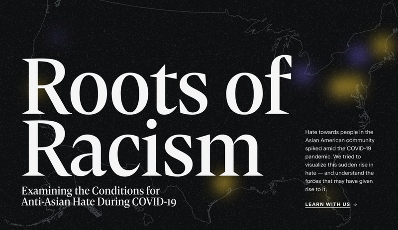
Silver: The Roots of Racism by Jack Beckwith
Bronze: Gaza Lives: Resisting Cultural Genocide by the Kontinentalist

Places, Spaces, & Environment
Gold: I Want a Better Catastrophe: A Flowchart for Navigating our Climate Predicament by Andrew Boyd, Jona Pomerance, and Marlan Dörk

Silver: Seeking shadow. A cool fix for hot cities by Urbi Atlas

Bronze: Buildings wrapped in solid gasoline by Mariano Zafra and Sudev Kiyada

Science, Technology, & Health
Gold: Zoonotic Web by Liuhuaying Yang

Silver: Navigate the obstacles to transportation electrification by Radio-Canada
Bronze: Beyond Crisis: Lives Saved by Jessica Russo

Unusual
Gold: World in Tangible Fragments by Nadezda Andrianova

Silver: Material Interactions: Data-Driven Community Quilting by Syracuse University School of Information Studies

Bronze: Hello From The Data Vandals (or free as air and water, or whatsoever things are true) by the Data Vandals

Special Awards
Impressive Individual
Gold: Liuhuaying Yang

Liuhuaying submitted 6 works this year and contributed to a 7th, 3 of which were shortlisted Judges were incredibly stunned, writing: “I truly got lost in Liuhuaying’s data stories. They are not only perfectly crafted and visually stunning, but actually insightful.” And, “Liuhuaying Yang’s work stands out for its clarity, consistency, and thoughtful design. The three pieces she was shortlisted for in this year's IIB Awards share a coherent visual language—clean layouts, creative metaphors, and an intuitive flow. What impresses me most is how she breaks down complex ideas into digestible, engaging segments.”
Silver: Diana Estefania Rubio

Judges were similarly impressed with Diana’s work, writing: “Her breadth of work on her portfolio and the sheer volume of long listed titles speaks to her diverse capabilities as a designer.” And, “Her artistic approach to data visualization stands out for its creativity and craftsmanship. She skillfully transforms complex information into visually compelling narratives using imaginative shapes, thoughtful color palettes, and strong editorial sensibility.”
Bronze: Kenneth Field

This year Kenneth Field submitted a project, Total Eclipse, that wowed judges, and in conjunction with his outstanding work communicating and teaching data visualization, it earned him the Bronze Impressive Individual award. One judge wrote:, “His contributions to the study of map/cartography (e.g. Mars Map and his books as well) and history of cartography (e.g. his 3Dd version of minard’s Napoleon March) opens me [to] new perspectives on these famous historical works.”
Outstanding Studio
Gold: The Pudding
Year after year The Pudding has continuously published impressive data storytelling pieces. One judge wrote: “The Pudding has not only been able to consistently deliver innovative and ground-breaking pieces of interactive visual storytelling, but has done it as an independent studio with a focus on collective management and transparency. I believe what sets The Pudding apart from other studios is its openness to share their knowledge and expertise with the data community —-- via lengthy live streams discussing ideation, visualization and coding of stories, or its own Awards program with a focus on new up and coming talents. Over the years, The Pudding has established itself not only as makers of some of the best visual stories in the field but, more importantly, as pivotal members of the data community interested in giving back and sharing some of the greatness that they channel. That is no small feat.” Another wrote: “The Pudding has consistently delivered standout data visualization work including this year, and creates space for chart types and topics outside the norm. That said, they are more of a curator of these pieces that showcase excellence in data viz than a studio of creators themselves, as contributors pitch and publish work in collaboration with the team.”
Silver: Revisual Labs

Revisual Labs is only two years old but is proving the true power of visualization through their substantial works already. One judge wrote: “Revisual Labs's stories have always caught my attention given the wide array of skills involved in putting them together as well as the amount of effort put into each of them. Mera's First Vote's, for example, not only boasts beautifully illustrated charts and page layout but contains dozens of individually uploaded YouTube interviews. Many readers might not even watch any of them, but the effort put into including them in the story is admirable. Through their work and online presence they show their ability to deliver data projects both on the corporate dashboard end as well as experimental storytelling ideas. “
Bronze: The Kontinentalist

It’s clear that while young, the Kontinentalist is already making waves. One judge wrote:, “The Kontinentalist's approach to visual storytelling is so particularly their own that each and every piece they put out is not only more ambitious than the previous one but unapologetically them. Their visual style, visualization solutions and topics of interest present a unique and comprehensive perspective on Asian issues that signifies a genuine curiosity and interest on Asian identity and politics. Their fearlessness to discuss heavy-hitting political subjects and expose realities many would shy away from is admirable, and their collective approach to their work makes it clear it's a labor of love.”
The Kontinentalist’s shortlisted project, Gaza Lives: Resisting Cultural Genocide, was extremely poignant.
Rising Star
Mandy Spaltman

The rising star is an individual who is early in their career and had a project make the shortlist (or three make the longlist), has not won an Award in the past, and only began their career in recent years. Judges wrote about Mandy’s selection: I was really impressed with the quality and breadth of Mandy's work. The submitted work ‘Europe, Visualized’ showed a nice combination of data viz and data art. I also appreciated that looking at their portfolio, you can see clear growth in figuring out what can be edited down in a visual versuss. what must be kept.” They also noted her remarkable ability to merge analytical depth with editorial clarity, creating data visualizations that are not only technically sound but genuinely enjoyable to explore. Her portfolio already carries the mark of a seasoned professional, which only makes her recognition as a Rising Star all the more exciting.
Test of Time
RAWGraphs (formerly RAW) by DensityDesign, Calibro, Inmagik

Ranked the top choice by three of four judges, it’s clear that RAWGraphs has withstood the test of time over the past decade, paving the way for many other data visualization online creation softwares and continuing to serve as an essential tool for many data visualization practitioners.
Most Impactful Community Leader
Lisa Charlotte Muth

Nominators and judges were equally impressed with Lisa’s many contributions to the field over the past decade, noting her commitment to educating the field on the do’s and don’t’s of color in data visualization in her numerous articles for Datawrapper, her advocacy for accessibility in data visualization, and her devotion to building community and communication through her Data Viz Book Club.
Community Vote
Aguayos: Exploring the Beauty of Migratory Flows within Latin America and the Caribbean by Mariana Villamizar

Most Beautiful
Is the Love Song Dying? By David Mora and Michelle Jia
https://iibawards.herokuapp.com/showcase/7176-is-the-love-song-dying
The Most Beautiful is selected from all the shortlisted works and judges were impressed by this project at every turn. “The cherry-on-top is not only storytelling, but asking the user (breaking the 4th wall) to remove categories based on each one's beliefs. Interesting approach!”

