10万条挂号大数据显示:互联网也救不了看病难 by DTimes
Infographics are the key elements to shed light on the story, thus making Chinese hospital registration issue more clear and understandable to the audience.
Hospital registration procedures has become a serious issue in China in recent years. It can be attributed to the over-demand of patients who prefer to go to hospitals with better quality. It is always said that "seeing a doctor is like fighting a war, while registration in hospitals just is like the transport during Spring Festival". Patients are always in line for 3 hours for 3-minute talks with doctors, with advanced internet reservation registration online platform which is designated to facilitate the procedures, the supply and demand between the hospitals/doctors and patients are still imbalanced. Many institutions have tried to make analyses on the issue, but most of those researches are too general and boring, so the readers cannot understand the whole picture in an intuitive way. Therefore, we made a new attempt by using collected big data and infographics to illustrate the phenomenon in detail and try to make some explanations.
We chose a typical reservation registration online platform with comprehensive big data about patients and hospitals information. Then we collected and analyzed those data including the number of appointments, hospitals, geographic location, satisfaction rate etc. In the first infographic, we illustrated the whole picture of Chinese hospitals with and without online registration system. With the geographic data, audience may clearly see the imbalanced distribution of general Chinese hospitals and those support online reservation of registration: medical resources are extremely uneven in China. In Eastern China, the hospitals with online registration available are concentrated while in Western China those hospitals are hard to find. Usually one needs to describe the problem a paper, but it is more than clear to show on the infographic can be easily seen even by the children through the shining spots on the map.
Infographics are used not only to illustrate difficult problems but also to make new findings. The second infographic shows a virtual line from Shanghai to inner cities in north-west part of China, along which those cities have higher online reservation rate compared with others. We had no idea about the line until we use tools to demonstrate data on the map. Data led us to make new findings which can be further studied in the short future. It is another charm of visualization and infographics.
Besides maps, we also used other charts to illustrate the hospital registration in China. In the fourth infographic, we put the number of people using online registration of each province in China on a chart, which shows certain hospitals are over-crowded. This tells another key issue: a large number of people only choose the best hospitals of their province even though those hospitals are difficult to register. The red points, which represent the most popular hospital in each province, proved everything.
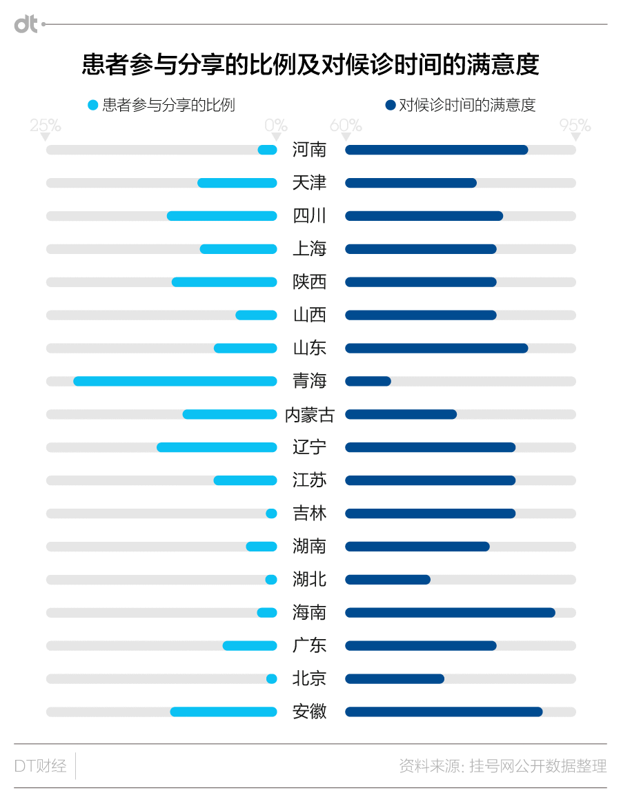
In addition, we also used a simple bar graphic to show the differences between registration numbers in each province and patients’ satisfaction rate of hospitals. When the article was published, it spread quickly in mass media and quickly got attention of the insiders. The charm of the story does not lie in the words, but in the infographics which helped illustrate key issues through big Data.
-
CreditsEditor:Wang yue Subeditor:Ye huijue Designer:Zhou lei
-
Award
-
Categories
-
See more


