Making the Connection by FFunction
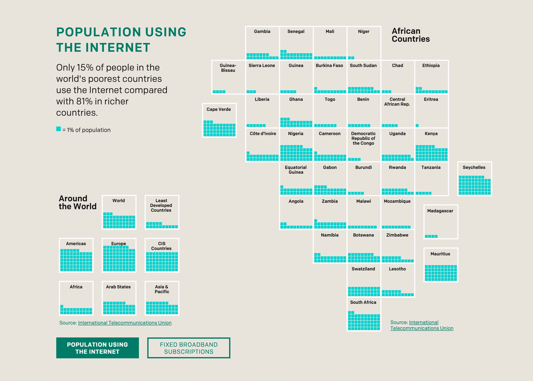
Right now, more than half the world is not connected to the internet, and almost 75% of Africa is offline. Why does this matter? For people living in the poorest parts of the world, access to the internet isn’t a luxury—it’s life-changing.
ONE, a campaigning and advocacy organization, is currently rolling out several programs to address this digital gap. They asked FFunction to create an interactive data visualization that would highlight some key findings and contextualize them in an engaging, shareable way.
As part of ONE’s larger Poverty is Sexist campaign that calls on communities, governments and private sectors around the world to help impoverished women within their countries, this site illustrates how access to the Internet and digital media can empower people in developing countries, especially women.
Displayed on a single scrolling page, the site presents two main visualizations: one shows the current rate of Internet usage in African countries, and another further breaks down the first viz by gender to show the disparity between women and men who use the Internet in Africa and around the world.
A form at the bottom of the page directs visitors to sign the Poverty is Sexist petition.
FFunction's design team decided the best way to contextualize the data would be to contrast how the internet improves the quality of life in the wealthiest parts of the world, compared with the most poverty-stricken.
For example, every month, over 560 billion text messages are sent worldwide. Of course, these can be useful for chatting with friends or receiving appointment reminders. But in sub saharan Africa, text messages can allow women who live far from a doctor to receive advice on how to have a safe and healthy pregnancy.
Poverty is sexist—in so many ways, girls and women are hit harder and have fewer opportunities, and access to the internet is no different. Women in the poorest countries are almost a third less likely to have access to the Internet than men, and the gap is increasing.
Visualizing this data and putting some context around it helps engaged citizens, journalists and policymakers to understand the problem in both broad strokes and granular detail, and—hopefully—take action.
The creator of this work has supplied multiple images, please click here to view.
-
CreditsAudree Lapierre - Creative Director Wim Bruyninckx - Art Director Chloe-Eve Levasseur - Designer & UX Specialist Cathryn Griffiths - Front-end Developer
-
Award
-
Categories
-
See more


