Election Results in the Third Dimension by Max Galka
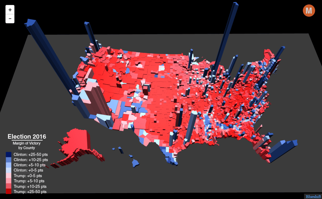
The typical red/blue U.S. election map is in some ways deceiving. Since there is no adjustment made for population density, the balance of colors often tells you very little about which candidate won or lost. This map corrects for this shortcoming by extending each county into the third dimension, the height representing that county's total number of votes.
-
Credits
-
Award
-
Categories
-
See more


