
House Of Cards by ABC News (Australian Broadcasting Corporation)
In 2017, Australia’s housing market began the long slide into what has since become the worst property downturn in the country’s history.
This project, published on the eve of the downturn claiming this dubious title, used exclusive data from analytics firm Corelogic to compare the decline to previous historical downturns.
We sought to answer two key questions:
- How bad is this decline?
- How bad is this decline in specific neighbourhoods?
DEFINE “BAD”
A house price slump can be bad because the decline is: a) big b) widespread c) sharp/steep d) sustained, or e) a combination of the above.
We relied on several datasets to examine how the 2017-18 decline compared on each of these measures – nationally, and in each of Australia’s eight capital cities.
ILLUSTRATE “BAD”
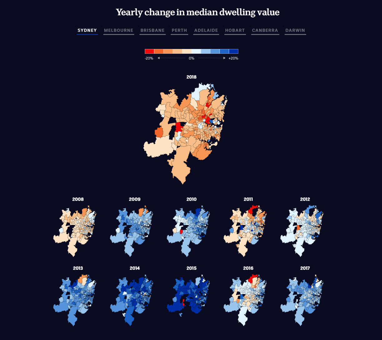
We used suburb maps of the eight capital cities to show the geographical distribution of house price changes over the past decade
We then examined 38 capital city housing downturns recorded since 1980, using a line chart to plot how sharply prices fell and how long each downturn lasted.
We highlighted the impact at the top end of the property market via:
- a bar chart showing the price change in Australia’s million-dollar postcodes
- a line chart showing how the sudden drop in the number of million-dollar postcodes
Using detailed historical data to examine the decline from multiple angles, we showed that the decline was not the sharpest nor most widespread (yet) but was on track to be the largest, particularly in Australia’s two largest cities, Sydney and Melbourne.
HOW BAD IS IT FOR YOU?
We built two interactive databases to show users personalised results. These tools allowed users to compare the data for their neighbourhood to other neighbourhoods in their local area or state.
The tools worked like this:
- When users enter a postcode or suburb, the tool matches it to three other geographic areas: their region, council area and state.
- A line chart compares that postcode’s median house price over 21 years (1998-2018) to every other postcode in that state - this is the “big picture”
- Users can filter that view to only the postcodes in their region, or other regions in their state
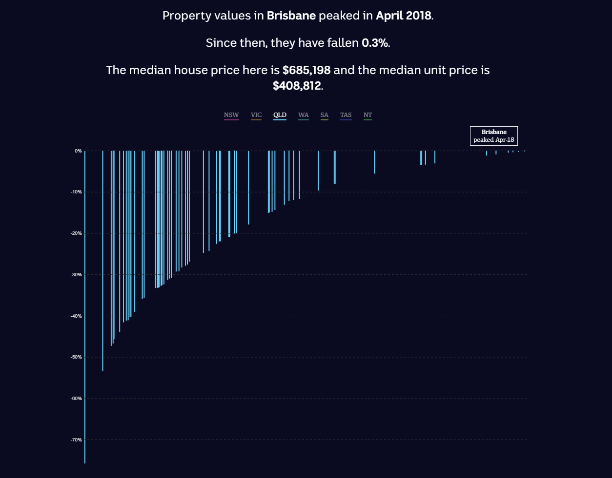
- Scrolling down, users then come to a column chart, which shows how far house prices in their council area have fallen since their peak
- This chart can be filtered to show only council areas in a state/territory
- The databases are linked so users only need to enter their suburb or postcode once. The second search bar allows users to enter a new suburb or postcode if they want to explore the data further
These tools showed that national or even city-wide figures mask significant differences between local areas, with some neighbourhoods hit far harder than others.
The entrant has supplied multiple files for this project:
[1] [2] [3] [4] [5] [6]
-
CreditsInga Ting, Digital Story Innovations team; Ri Liu (developer), Nathanael Scott (developer), Alex Palmer (designer), Geoff Thompson (reporter) and Alex McDonald (producer)
-
Award
-
Categories
-
See more


