Rich School, Poor School: Australia’s Great Education Divide by ABC News (Australian Broadcasting Corporation)
This project used exclusive income and spending data for every school in Australia to show for the first time exactly how big the divide between rich and poor schools has grown.
The divide is so large that even leading Australian education experts described the figures as “extraordinary”.
Features previously unseen data.
At the core of this investigation is My School data – one of Australia’s most tightly-held datasets on school resourcing.
Numerous media outlets have attempted to scrape the data since the creation of the My School website in 2008. ABC News is the first to successfully scrape the full dataset.
To verify the data, we worked closely with academic researchers familiar with the data.
Ground-breaking analysis
ABC News’ analysis is the most comprehensive and detailed to date, comparing the individual finances of nearly every school in Australia across a five-year period.
This was the first year a representative analysis of income and spending was possible because:
- A federal government program distorted spending patterns between 2008 and 2012, and
- Capital spending varies significantly from year to year, so data needs to be normalised across a number of years
Innovative visual storytelling
Our visual language had two main aims:
- To cut through the numbers by connecting the data with the reality on the ground – specifically, the schools and communities that readers know
- To show how each of the 8,500 schools fit into the bigger picture; a story previously untold because the only data available were summary statistics.
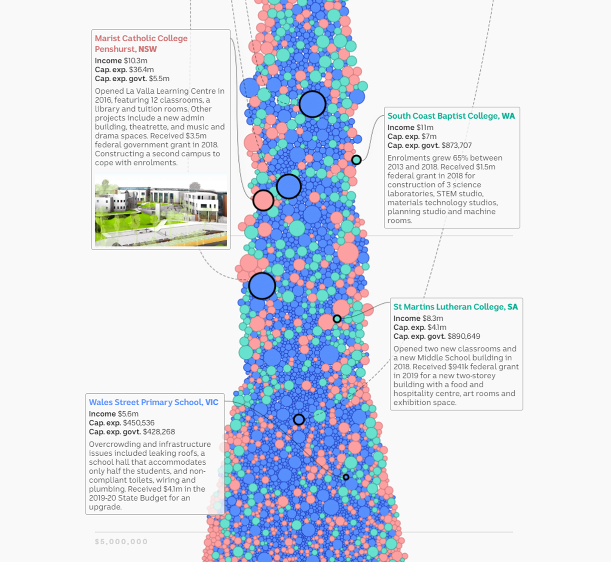
For the opening visualisation, we combed annual reports, school newsletters, fundraising brochures, P&C bulletins, campaign videos, architectural plans and development applications for dozens of schools
The technical challenge of visualising 8,500 dots – particularly for our large mobile phone readership – required creative responses
For example, we chose to avoid the distraction of interactivity in the opening visualisation. Instead we guided the audience through a “long-scroll” graphic by highlighting specific schools with GIFs, 3D fly-throughs, time-lapse videos, text and photos.
This helped readers make the explicit connection between the data and the schools in their communities
Crowdsourced data
Our story went beyond the numbers, using online survey tool Screendoor to crowdsource data on the capital funding needs of schools across Australia
This proved invaluable for reaching out to under-resourced schools, which are often prevented from speaking to media by government education departments or non-government sector authorities
The survey collected data, photos and personal accounts from dozens of school principals, P&C committees, teachers, students, former students and parents
Unprecedented database
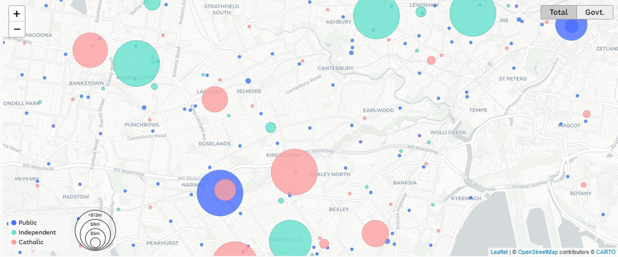
Lastly, we built an interactive database to show readers “personalised” data for their school, and present our data transparently
The map allowed users to compare public and private funding and capital expenditure for any given school and its neighbours across the nine-year dataset
The entrant has supplied multiple files for this project:
[1] [2] [3] [4] [5]
-
CreditsInga Ting (data journalist); Nathanael Scott (developer); Alex Palmer (designer); Ri Liu (developer); Michael Workman (audience development producer)
-
Award
-
Categories
-
See more


