The Data Visualizations Behind COVID-19 Skepticism by MIT Visualization Group
Throughout the COVID-19 pandemic, data visualization has been a political battleground. Well-known graphics like "Flatten the Curve" played a central role in early public health messaging around pandemic response. But just as public health institutions and data journalists have deployed data visualization to argue for pandemic response measures like masking and vaccination, self-described "anti-maskers" have used similar data-driven rhetoric and appeals to scientific rigor in order to oppose public health measures like mask mandates. These anti-maskers use the same datasets and visual presentation techniques to create narratives that directly contradict the conclusions of newspapers and public health organizations.
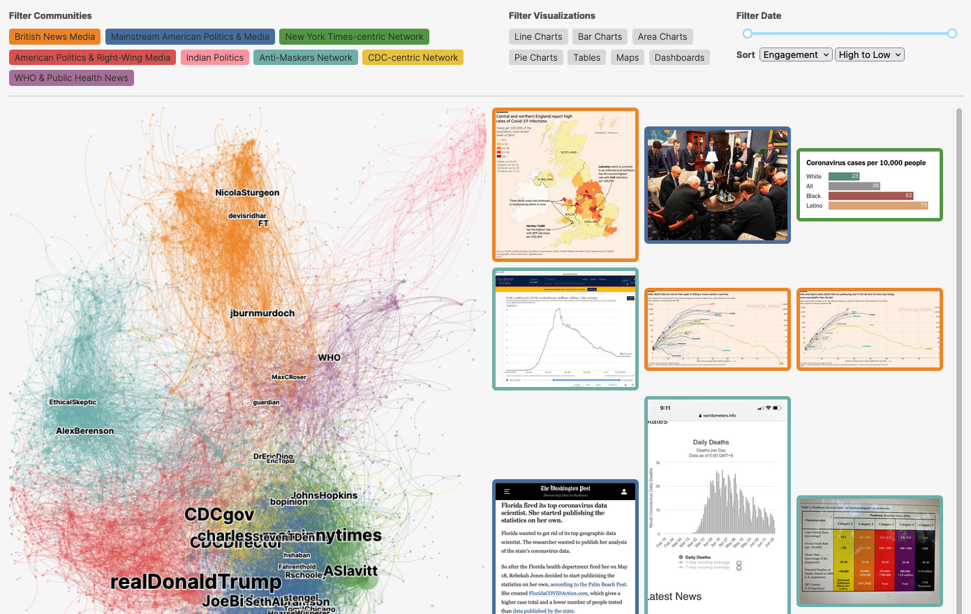
While it's tempting to dismiss anti-maskers as simply uninformed, or "anti-science," our work argues that anti-maskers' skillful use of data visualization points to a deeper epistemic conflict over scientific legitimacy. Based on an award-winning study of COVID-related data visualizations, this digital storytelling project combines a quantitative study of 41,000+ visualizations and 500,000+ tweets with an ethnography of anti-mask Facebook groups in 2020 to show how visual information is discussed, dissected, and disseminated. We found that anti-mask communities on social media organize in opposition to the discursive and interpretive norms of the mainstream public sphere, argue for open access to government data, and iteratively refine visualization designs. Indeed, anti-maskers often reveal themselves to be more sophisticated in their understanding of how scientific knowledge is socially constructed than their ideological adversaries, who espouse naive realism about the “objective” truth of public health data.
Our work shows that data is not neutral; there is no such thing as objective data analysis. Instead, data analysis is driven by stories that are shaped by cultural logics, animated by personal experience, and entrenched by collective action. As such, the scientific community's typical responses — more data, better visualizations, or increased data literacy — are not enough to address the fundamental political struggle at the heart of pandemic data visualization.
This data storytelling project was created by a team of interdisciplinary researchers at MIT in computer science and media studies, and the results have been presented to policymakers at the US Department of Health and Human Services and the UK Prime Minister’s Office.
-
CreditsResearch By Crystal Lee, Tanya Yang, Gabrielle Inchoco, Graham M. Jones, and Arvind Satyanarayan Interactive Article By Crystal Lee, Jonathan Zong, Anna Arpaci-Dusseau, Katherine Huang, Mateo Monterde, Ethan Nevidomsky, Tanya Yang, Anna Meurer, Soomin Chun, and Arvind Satyanarayan
-
Award
-
Categories
-
See more


