
2015 – The Winners
What an amazing night!
We’re incredibly proud to announce the winners of the fourth Kantar Information is Beautiful Awards!
Thanks to everyone who spent time cogitating, digesting and deliberating on what has been a truly bumper crop of dataviz.
And congratulations to our winners.
Now delve in!
Data Visualization
-
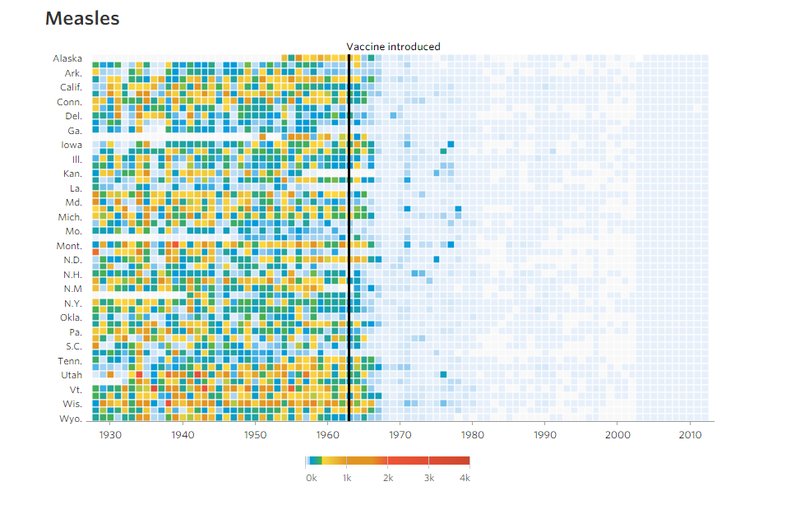
GOLD – Vaccines and Infectious Diseases by Dov Friedman and Tynan Debold at The Wall Street Journal
-
SILVER – A World of Languages by Alberto Lucas Lopez, published by SCMP
-
BRONZE – Rise of Partisanship by Mauro Martino and Clio Andris
-
Honourable mention – Close The Gap by Studio Metric
Infographic
-
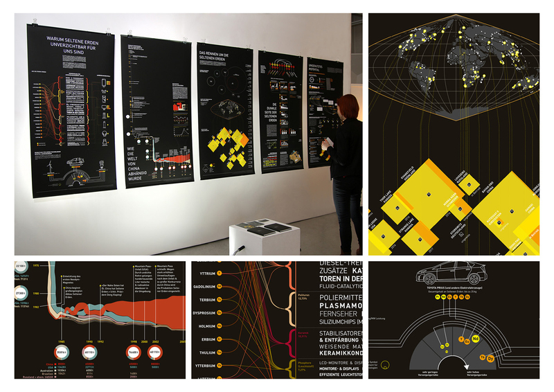
GOLD – Rare Earth Elements by Mark-Jan Bludau
-
SILVER – UFO Sightings by John Nelson and IDV Solutions
-
BRONZE – Valar Morghulis by Shelly Tan and Alberto Cuadra
-
Honourable mention – Rent, Salary, Price of Houses by The Visual Agency
Interactive
-
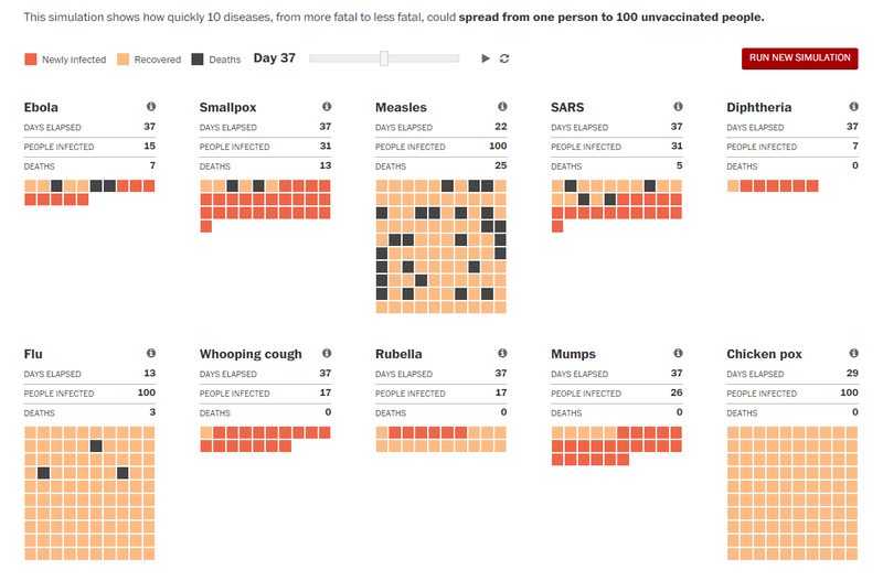
GOLD – How Ebola Spreads by Lazaro Gamio and Bonnie Berkowitz at The Washington Post
-
SILVER – The Counted: People Killed by Police in the United States in 2015 by Jon Swaine, Oliver Laughland, Jamiles Lartey, Ciara McCarthy (Reporting), Kenan Davis, Rich Harris, Nadja Popovich, Kenton Powell (Design and production), published by The Guardian
-
BRONZE (tied) – Job Market Tracker by Andrew Van Dam and Renee Lightner at The Wall Street Journal
-
BRONZE (tied) – Histography by Matan Stauber
Motion Infographic
-
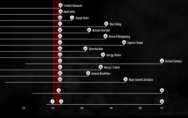
GOLD – The Fallen of WW2 by Neil Halloran
-
SILVER – How Many Trees Are There in World by Jan Willem Tulp of Tulp Interactive, published by Nature
-
BRONZE – Syrian War in 5 Minutes by Max Fisher and Johnny Harris, published by Vox
-
Honourable mention – Charting Culture by Maximilian Schich and Mauro Martino, published by Nature
Data Journalism

-
GOLD – German Unification by Christian Bangel, Paul Blickle, Lisa Borgenheimer, Fabian Mohr, Julian Stahnke and Sascha Venohr, published by Zeit Online
-
SILVER – Why Pinellas County Is the Worst Place in Florida to Be Black and Go to Public School by Nathaniel Lash, Martin Frobisher, Alexis N Sanchez, Michael LaForgia, published by The Tampa Bay Times
-
BRONZE – What's Really Warming the World? by Eric Roston, Blacki Migliozzi, published by Bloomberg Business
-
Honourable mention – California's Getting Fracked by Anna Flagg, Sarah Craig & Antonia Bruno, published by Faces of Fracking
Mini and Mobile Visualization
-
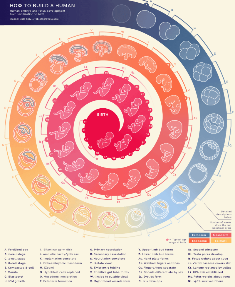
GOLD – How To Build A Human by Eleanor Lutz
-
SILVER – What's across the Ocean from You When You're at the Beach by Weiyi (Dawn) Cai and Ana Swanson, published by Washington Post
-
BRONZE – The Dude Map: How Americans Refer to Their Bros by Nikhil Sonnad, published by Quartz
-
Honourable mention – Here’s How Much of Your Life the United States Has Been at War by Philip Bump, published by The Washington Post
Free Dataviz Tool
-
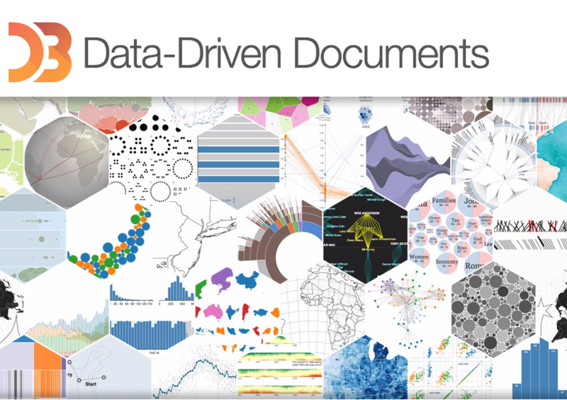
GOLD – D3.js by Mike Bostock
-
SILVER – R by Robert Gentleman and Ross Ihaka
-
BRONZE – Tableau Public by Tableau
-
Honourable mention – Quadrigram by Quadrigram
Dataviz Website
-
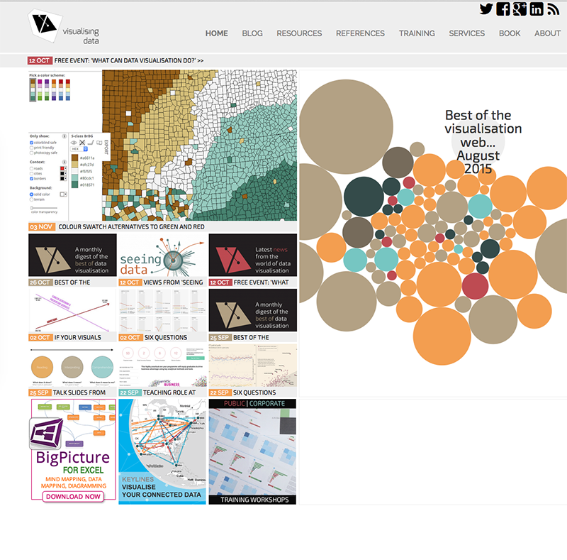
GOLD – Visualising Data by Andy Kirk
-
SILVER – Flowing Data by Nathan Yau
-
BRONZE – Visualoop by Infogr.am and Tiago Veloso
-
Honourable mention – Visual Complexity by Manuel Lima
Data Visualization Project
-
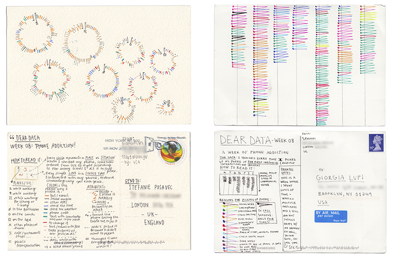
GOLD – Dear Data by Giorgia Lupi and Stefanie Posavec
-
SILVER – On Broadway by Daniel Goddemeyer, Moritz Stefaner, Dominikus Baur, Lev Manovich
-
BRONZE – 2014 Annual Report by Nicholas Feltron
-
Honourable mention – Surgeon Scorecard by Sisi Wei, Olga Pierce and Marshall Allen, published by ProPublica
Best Team
-
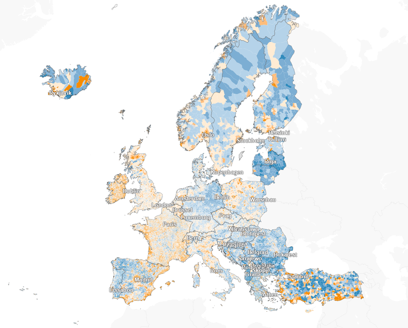
WINNER – Berliner Morgen Post for: Here’s How Loud It Is at Your Doorstep; M29 - The Bus Route of Contrasts and Where the Population fo Europe is Growing - and Where’s it’s Declining
Individual Achievement

-
WINNER – Tony Chu for Visual Intro to Machine Learning, Free Congress
Student

-
WINNER – Sara Piccolomini for: Freedom in Countries, published by La Lettura
Community Vote - based on entire Shortlist 2015

-
GOLD – The World in 2015 by Peter Winfield, John Parker, at The Economist
-
SILVER – Visualisation of Global Weather Conditions by Cameron Beccario
-
BRONZE – Drones by Michael Yap, Zoe Mendelson, Zack Davenport
Commercial Client Project

-
GOLD – Migration in the Census and in the News by CLEVER°FRANKE, University of Sheffield, The Migration Observatory, VisualisingData
-
SILVER – Rent, Salary, Price of Houses by The Visual Agency
-
BRONZE – LA Dodgers Digital Trading Room by Marc Maleh, Damian Boyd-Boffa, Gene Perelson, and team
Internal Business Project
-
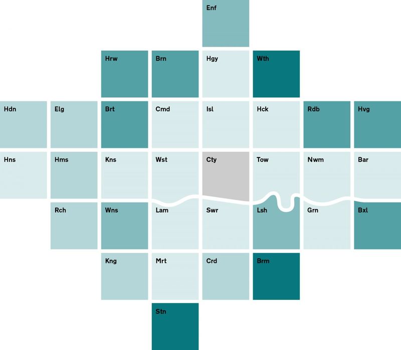
GOLD – London Squared Map: Making the City Easier to Read by After The Flood
-
SILVER (tied) – RPP Intranet by Robin Partington & Partners Studio Baako
-
SILVER (tied) – DHL GoGreen Solutions Workbook by Monika Rasche
Commercial Studio
-
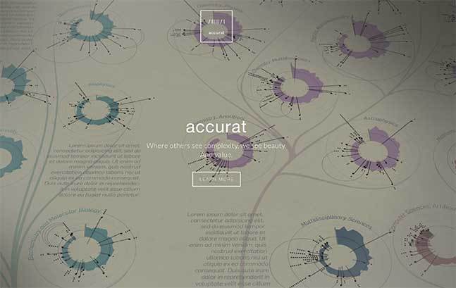
GOLD – Accurat by Giorgia Lupi, Simone Quadri, Gabriele Rossi
-
SILVER – Domestic Streamers
-
BRONZE – Periscopic
-
Honourable mention – Clever Franke
Most Beautiful
-
WINNER – Dear Data by Giorgia Lupi and Stefanie Posavec