2016 Awards Categories
Which categories will you be entering in this year's Kantar Information is Beautiful Awards?
Public categories
Gold ($1,000), Silver ($500) and Bronze ($250) in each of the following categories:
Data Visualization, Infographic, Interactive Visualization, Data Journalism, Dataviz Tool, Dataviz Website, Dataviz Project
Special Award Categories (at judges' discretion)
$1,000 in each of the following: Outstanding Team, Outstanding Individual, Student Award, Community Award, Commercial Project, Studio of the Year, Best Non-English Language Viz, Rising Star
$5,000 ultimate prize: Most Beautiful
Public Entry Categories
Honouring the best in dataviz, infographics, interactives and more, these categories offer prizes of USD $1000 (Gold); $500 (Silver) and $250 (Bronze). Judging is by a combination of our 40-strong panel of experts in the design and visualization field, aided by a public voting stage for visitors to the site.
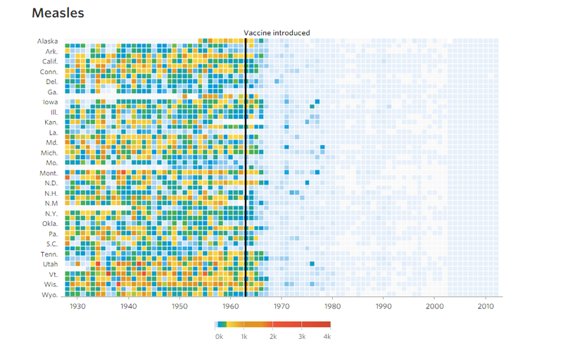
Data Visualization
A singular static visualisation of data, like 2015 gold award winner Vaccines and Infectious Diseases by Dov Friedman and Tynan Debold at The Wall Street Journal.
Infographic
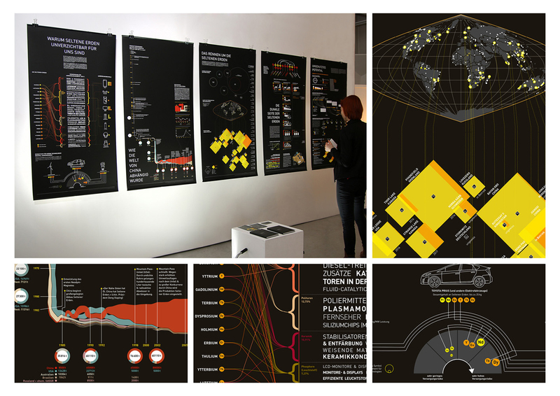
A series of data-visualizations along a story or theme, like 2015 gold winner Rare Earth Elements by Mark-Jan Bludau.
Interactive Visualization
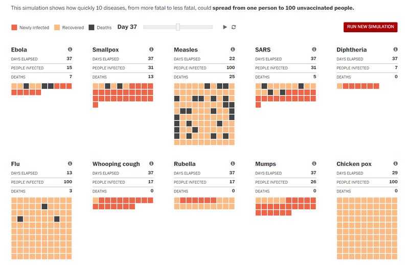
A viz or infographic that users can manipulate, filter, sort etc - like 2015's gold winner How Ebola Spreads by Lazaro Gamio and Bonnie Berkowitz at The Washington Post.
Data Journalism
Running text, visualisations and other media combined to tell a story - like 2015 award winner German Unification by Christian Bangel, Paul Blickle, Lisa Borgenheimer, Fabian Mohr, Julian Stahnke and Sascha Venohr, published by Zeit Online

Dataviz Tool
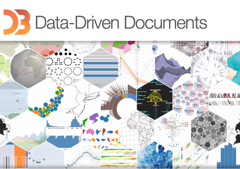
The best app (paid or free) to automate the creation of dataviz - 2015 gold winner D3.js by Mike Bostock. N
Dataviz Website
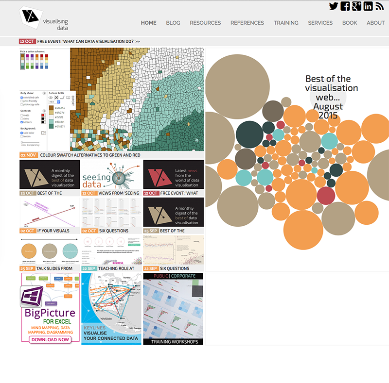
What’s your favourite website to see new work? Last week's gold winner Visualising Data by Andy Kirk.
Dataviz Project
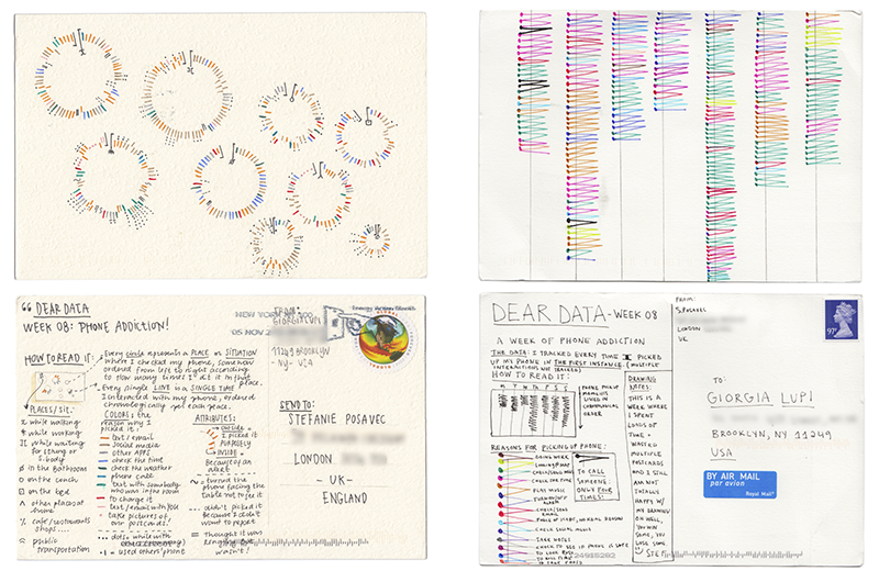
A collection of multiple visualisations in project or book form - like 2016 gold winners Dear Data by Giorgia Lupi and Stefanie Posavec.
Special Award Categories
The Special Awards are given at the judges' discretion in recognition of innovative work or excellence across multiple entries. There is also a Community Award for the most popular shortlisted entry during the public voting stage of the Awards.
Outstanding Team
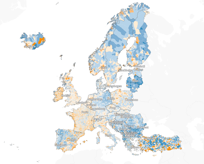
Most prolific and/or ground-breaking work from a team - like 2015 winner Berliner Morgen Post for: Here’s How Loud It Is at Your Doorstep; M29 - The Bus Route of Contrasts and Where the Population fo Europe is Growing - and Where’s it’s Declining
Outstanding Individual
Ground-breaking or prolific work from a single practitioner - like 2015 winner Tony Chu for Visual Intro to Machine Learning, Free Congress.

Student Award
Best work created by our student entrants - like Sara Piccolomini for Freedom in Countries, published by La Lettura

Community Award
Best entry as voted for by our community, like 2015 winner The World in 2015 by Peter Winfield, John Parker, at The Economist

Commercial Project
Best piece of work created for business reasons - like 2015 winner Migration in the Census and in the News by CLEVER°FRANKE, University of Sheffield, The Migration Observatory, VisualisingData

Studio of the Year
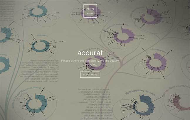
Most prolific and/or ground-breaking work from a commercial studio - like 2015 winner Accurat from Giorgia Lupi, Simone Quadri, Gabriele Rossi
New Special Awards for 2016:
- Best Non-English language viz
- Rising Star
Most Beautiful
The top award of $5000 goes to the judges' favourite entry across the entire Awards - which in 2015 was Dear Data by Giorgia Lupi and Stefanie Posavec.

Now it's your turn
:: Check out the winners from last year and 2015's showcase of shortlisted entrants
:: Head to the Awards page to enter your own work or nominate work you've seen
Entries close Friday 16 September.


