Visualising Financial Market Contagion by Marketcolor
On the ten year anniversary of the collapse of Lehman Brothers, how do we visualise financial markets contagion? It may seem an abstract question but abstract financial ideas cratered the world economy. We need inclusive data visualisations to make comprehensive assessments on the health of institutions and entire economies?
So, where to start?
Debt.
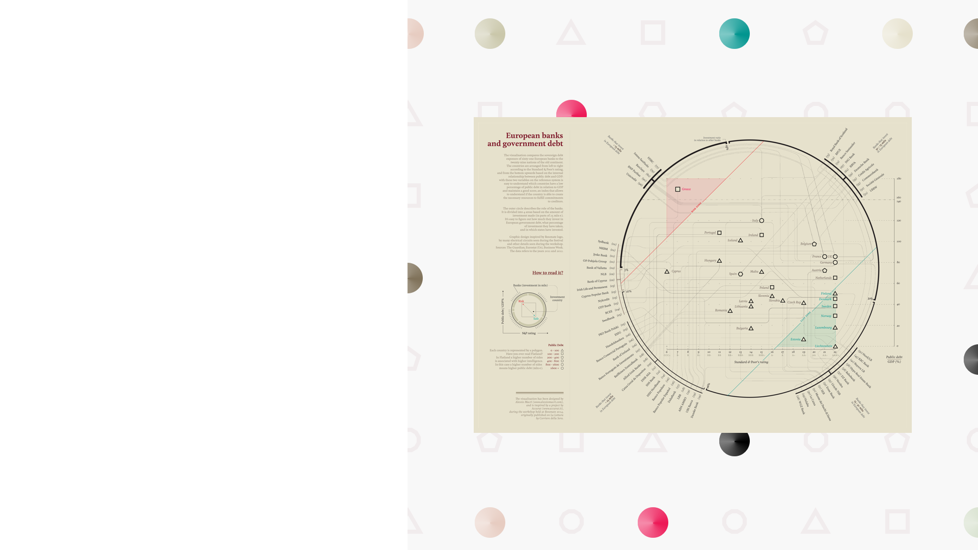
Take the credit ratings of European economies. Discrete, or classified data - from AAA to CCC. Then take those same economies debt-to-GDP ratios, and the quantities of that debt. Putting that information together gives you a scatter plot, and one where debt and credit ratings do not tell the full story. The size and the severity of a nation's debt and credit worthiness are not always the same thing: individual data points are categorised by shape to distinguish a €500m debt economy to a nation with billions of debt in issue.
Then consider the banks that are based in those economies - after all that is what contagion is - when the performance of a nation's debt affects the constituent financial institutions in that nation and vice versa. So, we took the official bank stress test results and sorted by the banks' own debt holdings. This is not data that would fit in a scatter plot, which explains the halo around the core data sets. The connecting lines maps which banks belong to which economies. Those economies with the most connecting banks in the most precarious zone of the scatter plot with a shape representing significant debt in issue (such as Italy) represent a dangerous combination and a higher propensity for financial market contagion. Especially in times of heightened market fear.
With thanks to Alessio Macri, original creator of the static graphic. Video created in Premiere, After Effects and Cinema 4D. The video highlight is part of a seven-minute deep dive into the data hosted by a macroeconomist.
-
CreditsTheo Casey
-
Award
-
Categories
-
See more


