
Counting The Cost Of The Education Revolution by ABC News (Australian Broadcasting Corporation)
In 2008, the Australian government announced an “education revolution” -- a fundamental overhaul of a school funding system that had been in place in essence since 1974. Billions were poured into the school system to achieve one key goal: improve student performance through more equitable funding.
Our investigation revealed that rather than closing the equity gap, the income divide for many schools has grown wider than at any point since the “revolution”.
The first challenge of this story was collecting the data; the second was finding the most rigorous way to use it; the third was transforming it into a compelling visual story.
PREVIOUSLY UNSEEN DATA
• At the core of this investigation is My School data – one of Australia’s most tightly-held datasets on school resourcing
• Numerous media outlets have attempted to scrape the data. ABC News is the first to successfully scrape the full dataset
• To verify the data, we worked closely with academic researchers who were familiar the dataset.
GROUND-BREAKING ANALYSIS
• ABC News’ analysis of school resourcing is the most comprehensive and detailed to date, comparing the individual finances of nearly every school in Australia over eight years
• The painstaking, five-month analysis is the first of its kind. Four independent education researchers validated our methodology and results
• Due to a lack of data, previous analyses have relied on aggregates and averages, which mask significant differences between individual schools
• Our methodology “compared apples with apples” by generating a unique set of similar schools for every school in Australia. This allowed us to show for the first time the worsening public/private divide between “like” schools.
CREATIVE VISUAL STORYTELLING
• Our visual language aimed to emphasise individual schools, as this was a key point of difference in our analysis
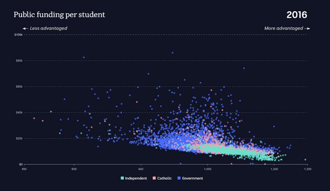
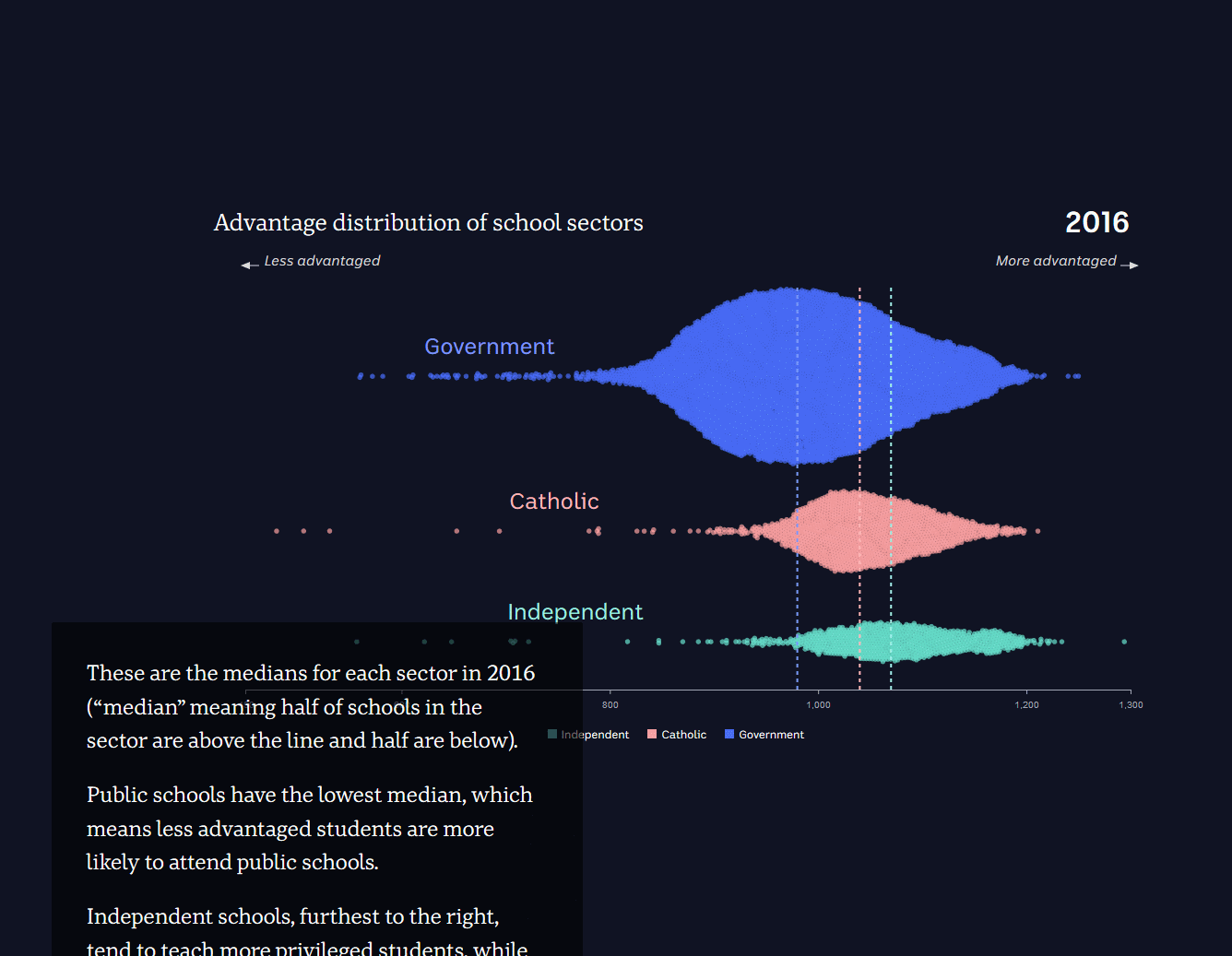
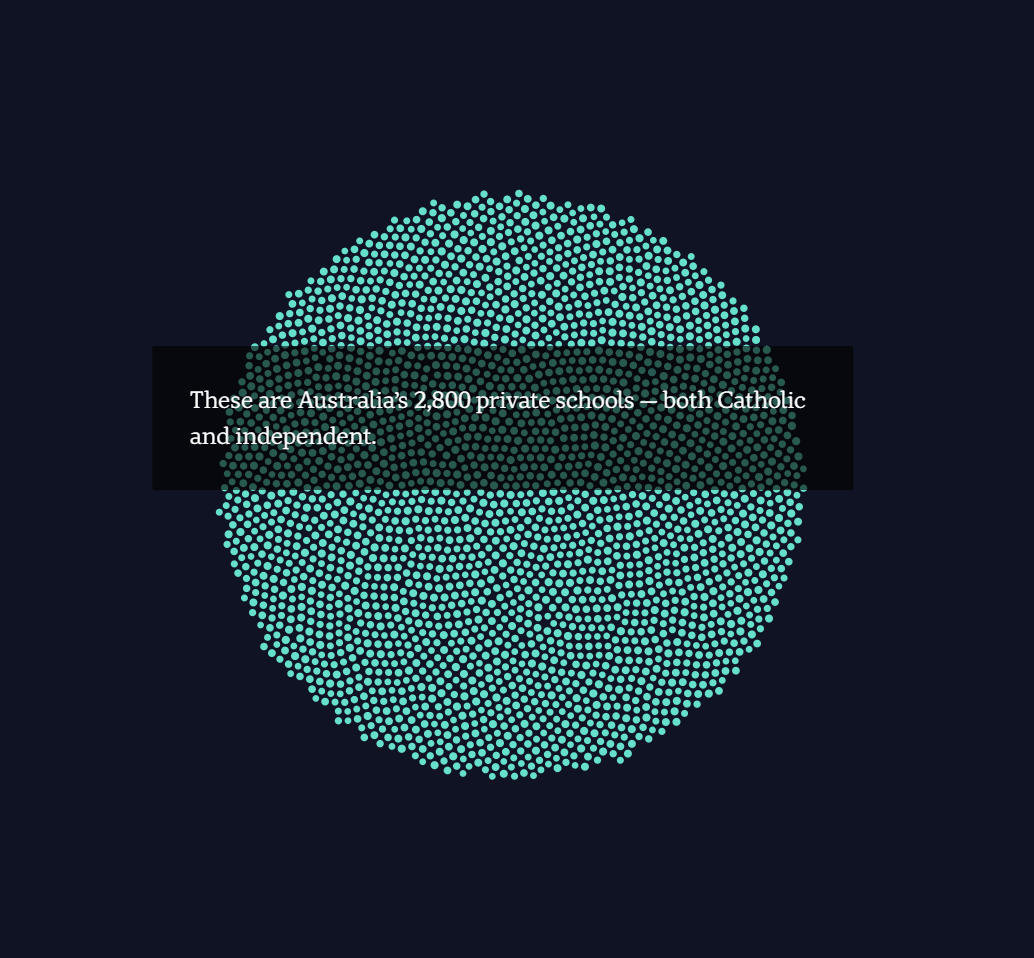
• We used line charts, bar charts and dot plots to orient the audience within the “big picture”, and beeswarms and scatterplots to demonstrate the stark differences between the individual schools that make up this picture
• The technical challenge of visualising 8,400 dots – particularly for our large mobile phone readership -- required creative solutions.
• With the beeswarm/scatterplot “scrollyteller” animation, dor example, there was too much data to calculate the layout in the browser, so we pre-calculated and stored the point locations for each step of the animation. This allowed us to present large amounts of data while avoiding long load times and high browser stress.
UNPRECEDENTED DATABASE
• Lastly, we built an interactive database to show readers “personalised” data for their school, and present our data transparently
• This database allowed users to compare the public and private funding gap between any given school and its unique set of similar schools across the country.
The entrant has supplied multiple files for this project:
[1] [2] [3] [4] [5]
-
CreditsInga Ting (data journalist); Nathanael Scott (developer); Alex Palmer (designer); Ri Liu (developer); Jack Fisher (video journalist); Natasha Robinson (education reporter); Michael Workman (audience development producer)
-
Award
-
Categories
-
See more


