Four maps that show how America voted by USA Today
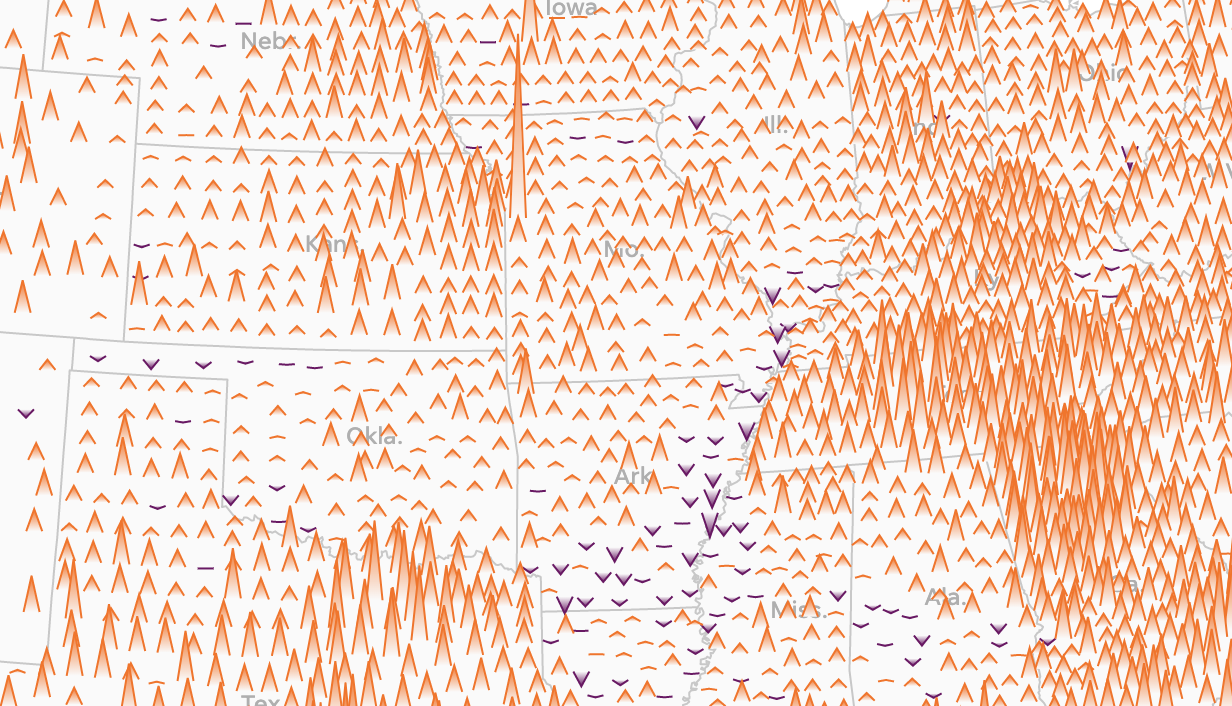
"Mapping American elections is difficult, and each mapping decision has its own strengths and weaknesses. Should one show raw margins, or percentages? Make the map easier to read geographically, or more better explain the impact of each county or voting area? Ultimately, the team decided to show a series of maps, each focusing on a different aspect of how the U.S. voted, in order to best explain to readers what was going on. In times where misinterpretation is easy and commonplace, illustrating the many angles of the issue is often the best approach.
We used Mapbox and D3 to create the maps, along with some Python for analysis. The raw margin map based on votes presented a challenge initially — with so many counties of differing sizes, circles frequently overlap and make it difficult to read — so we opted for a force layout approach, keeping the map as geographically accurate as possible while still maintaining readability. "
-
CreditsMitchell Thorson, Sr. Graphics Editor; Janie Haseman, Graphics Journalist; Carlie Procell, Graphics Journalist; Karina Zaiets, Graphics Reporter; Dan Keemahill, Web Developer; Kevin Crowe, Data and Graphics Journalist; Dian Zhang, Data Reporter.
-
Award
-
Categories
-
See more


