A Crisis, Visualised
Rifling through the ever-growing nominee list, we noticed some great examples of attempts to explain the Syrian war and the ensuing refugee crisis in different award categories.
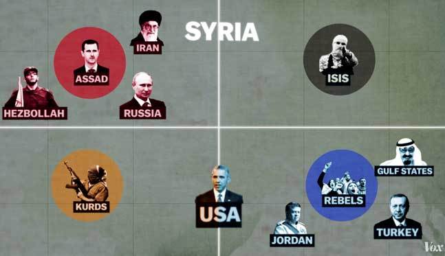
Syria's War: a 5 minute history – Vox: a concise motion infographic is good place to start for understanding the complexity of the situation.
Where Syrians find their refuge – The Economist: three levels of information successfully combined in one easy to read miniviz.
The tide of Refugees – SCMP: Clearly inspired by Minard's famous infographic, this one doesn't skimp on details either.
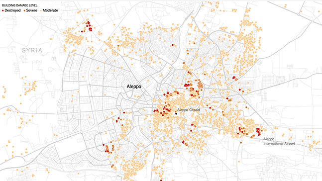
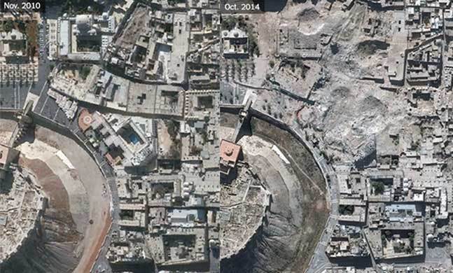
Atlas of a Country in Ruins – NYT: Data journalism and compelling before-and-after imagery reveal the scale of devastation.
Untangling the Overlapping Conflicts in the Syrian War – NYT: who is embroiled in the conflict
Have you seen any others that might deserve an award?


