
From when I first saw the situational comedy show Brooklyn Nine-Nine, I’ve probably rewatched it ten times over. I’ve always wondered what made the show so special. What about this show makes me...
-
 View projectThis Mondrian-inspired visualization explores the economic divide between necessity and luxury for the average American household. Using 2023 data to gauge living wages—given that the U.S. Census...
 -
 View project26 March marked the 18th anniversary of the death of Stanislaw Lem, Poland's most famous (science fiction) writer. Come with me on a journey into the solar system of his works.
 -
 View projectCosmere.info is a large-scale interactive data visualization that illustrates the expansive literary universe of Brandon Sanderson. The project represents over two months of meticulous manual data...
 -
 View projectDatabeads is a grassroots initiative that’s all about bringing data visualization into a whole new space—off the screen and into wearable, everyday objects. We’re a couple from Budapest working...
 -
 View projectMetro systems are the pulsing veins of cities, traverses the city’s texture and preserving the memory of urban life. Visualizing this invisible urban landscape becomes emblematic of each city’s...
 -
 View project“La Vorágine,” written by Colombian José Eustasio Rivera, portrays the brutality of exploitation in the Amazon rainforest and denounces the social injustices that afflict the most vulnerable...
 -
 View projectThis viz showcases 12 trailblazing directors and their filmographies. They are game changing, impact making directors. Hover over the directors' name to learn more about them. Click on an icon...
 -
 View projectProject Santa invites viewers to step into Santa’s boots, exploring the lives of 110 participants as they navigate the joy and loneliness of the Christmas season. Through a series of interactive...
 -
 View projectVisions in catastrophe; conflict and the creative mind, is a computational art historical analysis of cataclysm, war, and artistic production. One hundred and twenty three of history’s most...
 -
 View projectThe Art of Perseverance and Relentless Pursuit of Culinary Artistry. This project delves into the prestigious James Beard Foundation Awards, examining the achievements of outstanding chefs in...
 -
 View projectStamps are more than just pieces of paper; they often commemorate important historical events, figures, or milestones. For collectors, owning a stamp is like owning a piece of history. The...
 -
 View projectIn the 1993 comedy, Groundhog Day, waking up on February 2nd means one thing for weather man Phil Connors (Bill Murray): another day spent in an inexplicable time loop in Punxsutawney, PA. This...
 -
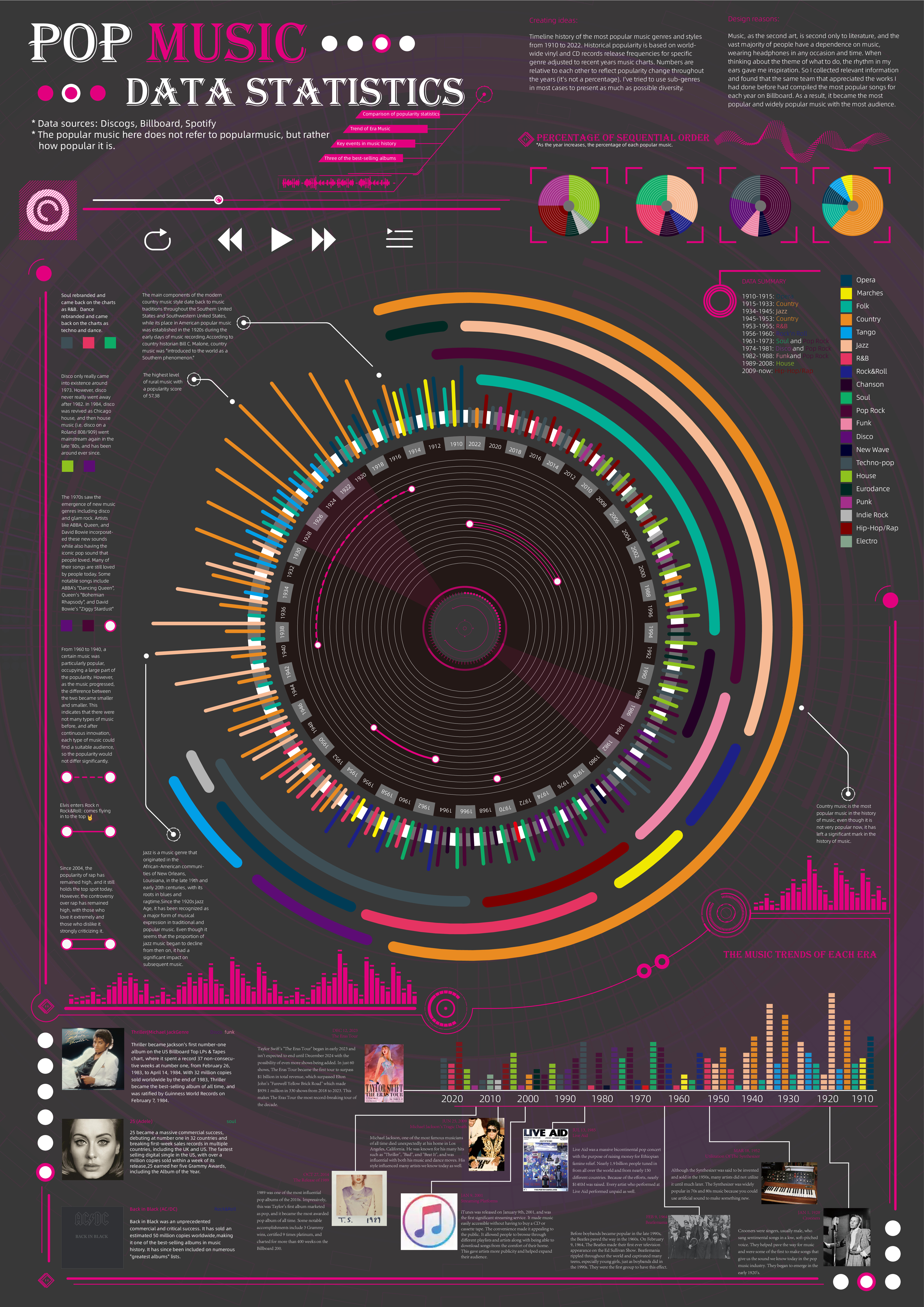
 View projectTimeline history of the most popular music genres and stylesfrom 1910 to 2022.Historical popularityis based on world-wide vinyl and CD records release frequencies for specificgenre adjusted to...
 -
 View projectGodzilla is a worldwide pop culture icon that originates from Japan back in 1954. Over the years we have seen 46 film releases, but the question is.. how many Godzilla films is too many?
 -
 View projectTo be strong is a demand from our capitalist societies. Isn’t it? But who defines, what „strong“ means, and is „weak“ always worse? For whom? When I came to finish my design studies, it was...
 -
 View projectThe project, created in 2024, is dedicated to the 25th anniversary of the release of the first part of the Matrix trilogy. The Matrix is primarily associated with green shades, but the color...
 -
 View projectThis project showcases a popular Japanese food show, Kodoku No Gurume (Solitary Gourmet) and its 12 seasons.
 -
 View projectTaylor Swift’s Eras tour left an indelible mark on the cultural and economic landscape of 2024. According to the New York Times, over the course of 21 months and 149 shows, the tour boasted over...
 -
 View project"Constellations" is a research project, inaugurated in 2024 by the FANGOR Foundation, in the form of an interactive Map visualising the chronology of life and artistic activity of Polish spatial...
 -
 View projectInstant ramen is more than just a convenient meal—it's a cultural phenomenon that has shaped global food habits. This data visualization uncovers the story behind its rise, from its invention to...
 -
 View projectStep into the vibrant world of Eurovision with this data-driven piece - where every flag tells a story, and every bar represents a nation's voice in the ultimate musical showdown. Each country’s...
 -
 View projectA long form visualization telling the history of Fat Bear Week at Katmai National Park, featuring a stylized march madness style bracket and custom bear icons.
 -
 View projectLearning about data practices doesn’t always require visual engagement—I often turn to podcasts while commuting, cooking, or exercising. In this visualization, I highlight the top 12 data podcast...
 -
 View projectThe visual thesis deconstructs the process of trend forecasting in typeface design. It explores the factors driving these trends, from cultural shifts & technological advancements to artistic...
 -
 View projectThe project 'Talaas: A Data-Driven Visualisation into Bharatnatyam Rhythms' uses data visualisation to explain rhythmic patterns engagingly. It starts by introducing Talas, their origins, and their...
 -
 View projectImagine turning the screen-time dynamics of the show "The Office" into a visual journey through Dunder Mifflin! This data visualization project dives deep into the shared screen time among...
 -
 View projectThis work is an information visualization design in traditional Chinese colors, our IDEA is based on the traditional Chinese design concept - “藏礼于器” ("materialization of materialization of...
 -
 View projectThis project aims to explain the nationwide trend of wearing traditional Chinese clothing, “Hanfu,” as everyday attire. Through a combination of text, visuals, charts, illustrations, and diagrams,...
 -
 View projectA hand-knit pair of socks is a luxury in an age of fast fashion and mass consumption. Amongst knitters, socks have a reputation for being difficult - the 3D shape of the heel turn sounds...