
I asked 200 people to tell me about a group or person with whom they feel belonging. From their responses, I created a flow chart that is several meters long.
At any point in the flow chart, the...
-
 View projectThis is the third piece in a triptych of three titled MAD (Music-Astronomy-Drugs). There is a shared musical, celestial, and psychedelic quality to all three pieces. Here I depict the safety (or...
 -
 View projectAs part of a Viz for Social Good challenge for the Global Deaf Research Institute, this data visualization highlights the major unmet need in the deaf community of Nigeria in accessing healthcare...
 -
 View projectThis poster shows bycatch in industrial fishery. Bycatch is other fish then the once that the fisheries target and a serious problem for our seas and the species that live in it. Those numbers you...
 -
 View projectThe annual and awe-inspiring migration of the monarch butterfly through North America is an odyssey involving multiple generations. From a first group that survives just weeks to descendants that...
 -
 View projectThe "Trading with Trump" infographic focuses on global trade and what stocks would initially benefit when Trump started his presidency based on what he has said during his campaign. Of Trump’s...
 -
 View projectIn this series of maps, Reuters traces the course of the Rohingya crisis, from the spasm of violence a year ago through to the daily lives of the refugees in teeming camps.
 -
 View projectThis is an interactive visualization of a thesaurus – the view highlights the relationship between central search word and its reference to other words used within the dataset. A query word is...
 -
 View projectThe refugee crisis was all over the news in the last year. This short video explores what impels people to leave their homes, which role the situation in Syria plays for those events and how that...
 -
 View projectHello. I am a book. But I’m also a portal to the universe. I have 112 pages, measuring 20cm high and wide. I weigh 450g. And I have the power to show you the wonders of the world. I'm...
 -
 View projectSpotlight is a series of occasional think pieces harnessing the power of the Firefly Millward Brown global network. One of the strengths of Firefly is the ability to quickly call on the expertise...
 -
 View projectThe project presents a generative approach to the book cover creation process. As a basis for generation, I chose a Peter de Jong attractor. Such text features as average word length, average...
 -
 View projectThis installation explores the complexity of the UK food system by highlighting the horticultural decline in home-grown fruit and the reliance on imports. The project is inspired by the purchase...
 -
 View projectBernwood & Steinward used data that have been gathered by the fantastic fan website u2gigs.com. This fan collective has collected all the data of U2 shows from the early years until the most...
 -
 View projectThe average person on earth would live 2.6 years longer if the air contained none of the deadliest type of pollution. Your number depends on where you live. The entrant has supplied multiple...
 -
 View projectThis AR visualization is an attempt to transcend traditional static displays and immerse visitors in the stark reality of ocean plastic pollution. The experience aims to educate and inspire action...
 -
 View projectCruising to a fourth term in the March 18 elections, Vladimir Putin is relying on a deep well of support based on two main factors: the huge rise in living standards over his 18 years in office...
 -
 View projectEach year, CLEVER°FRANKE (C°F) publishes a weather chart. In these annual charts, we explore methods to visualize last year's weather. CLEVER°FRANKE has a special affinity with the weather; the...
 -
 View projectThis interactive article presents a so-called “explorable explainer” of the k-means clustering algorithm. It attempts to push the envelope of how visual explanations can be designed on an...
 -
 View projectAn outbreak of green algae, or hutai in Chinese, has invaded the seawaters off eastern Shandong. It looks harmless and lots of fun, as beachgoers are pictured frolicking in the green mass. But...
 -
 View projectInteractive visualisation that can be used to view average CO2 emissions of cities worldwide at a glance, as well as to dive into the data for a specific city – both its emissions and trends over...
 -
 View projectThe Paris 2024 Olympic and Paralympic Games brought together thousands of athletes and fans from around the world. Portraits 2024 is a data visualization exhibition held amid the festivities and...
 -
 View projectAs part of the #VizforSocialGood community project, this data visualization showcases the amazing work of the Gord Downie & Chanie Wenjack Fund, a nonprofit organization seeking to build...
 -
 View projectDipsea Chimes is a kinetic data sculpture celebrating the Dipsea Race, America’s oldest trail race. Installed on a terrace overlooking Mt. Tamalpais—the race’s iconic setting—it is accessible to...
 -
 View projectBack in December 2020 the death of 300,000 Americans was already a staggering, incomprehensible loss. Little did we know then that the virus would take the loves of over six and a half million...
 -
 View projectA visual compendium of the Marvel universe showing each character and their history with the franchise. Since the series kicked off in 2008, the Marvel films have become a part of culture...
 -
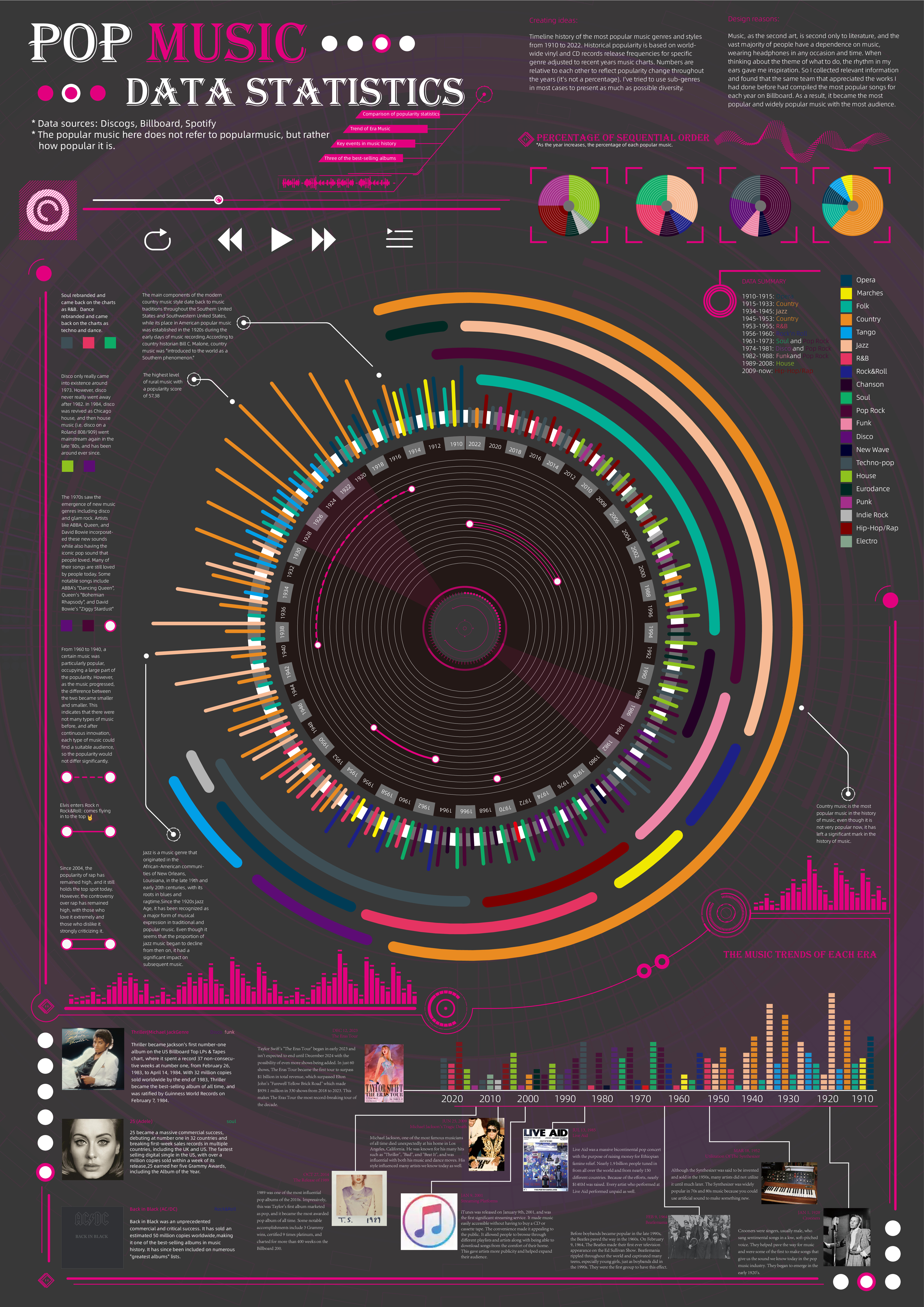
 View projectTimeline history of the most popular music genres and stylesfrom 1910 to 2022.Historical popularityis based on world-wide vinyl and CD records release frequencies for specificgenre adjusted to...
 -
 View projectThe Global Peace Index interactive map visualises the Global Peace Index (GPI), a composite index that measures peace in 162 countries according to 22 indicators. The objective is to engage a...
 -
 View projectPhoenixMap, a visual analytics system to help analysts understand spatiotemporal distribution patterns and anomalies of many objects. It focuses on solving quantitatively visualizing the spatial...
