Here are just a few of our favourite health-related visualizations so far this year. Nathan Yau has told us when people die and what people die from. Now he shows you How You Will Die given your sex, race and age. Which continent is big on sterilisation? Where ...
-

-

As the US elections draw near, the world wonders who'll replace Obama in the White House. While you wait, check out these fun interactives. See why polls should be taken with a grain of salt with Rock n Poll from Maarten Lambrechts. . What if the 'Bernie Bros' he...
-

With the Information is Beautiful Awards closing date (Fri 16 Sep) fast approaching, here are our favourite dataviz & infographic finds of the past week. Big-budget blockbusters are getting worse (Vox) A Visual Look at 2 Million Chess Games (Ebemunk.com...
-

With one month until the deadline, this is your reminder to enter or nominate your favourite dataviz, infographics and interactives from May 2015 to now. Professional creators enter your own work (students free; solo practitioners $25; media outlets $50; companies $100 per ...
-

Do you follow the Kantar Information is Beautiful Awards Twitter account or Facebook page? Our social media showcases the best dataviz, infographics and interactives around. Below are some of our favourite web finds of the week. Consider it inspiration: if you've seen somet...
-

With The Force Awakens quickly becoming last year's biggest hit movie it's no surprise that numerous artists decided to visualize stuff that happened "a long time ago in a galaxy far, far away." Here for your inspiration are four fantastic graphics based on the Star Wars saga....
-

Entries and nominations are now open for the Kantar Information is Beautiful Awards 2016. This is your chance for recognition in front of our 40-strong panel of judges and a public vote from our audience of 250,000. Our raison d'etre is to bring dataviz into the mainstream,...
-

Which categories will you be entering in this year's Kantar Information is Beautiful Awards? Public categories Gold ($1,000), Silver ($500) and Bronze ($250) in each of the following categories: Data Visualization, Infographic, Interactive Visualization, Data Jour...
-

In a week's time (week of 27th June 2016), entries open for the 2016 Kantar Information is Beautiful Awards. As with last year, our judges will be considering nominations made by dataviz-loving members of the public, alongside entries submitted by studios, agencies, publishers...
-

As we reported when the longlist went public, the superlative New York Times Graphics team was unable to take part in the awards as their editorial guidelines prevent entry to awards sponsored by commercial, political or professional associations. Nevertheless we think that th...
-

Celebrating the world's most outstanding dataviz, this year's Kantar Information is Beautiful Awards 2015 was held at Ham Yard Hotel in London's Soho. Here's what the press had to say: The Guardian Creative Review Design Week Fast Co. Create It’s Nice That D...
-
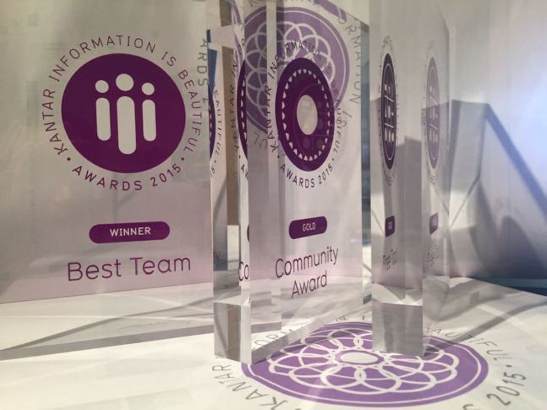
What an amazing night! We’re incredibly proud to announce the winners of the fourth Kantar Information is Beautiful Awards! Thanks to everyone who spent time cogitating, digesting and deliberating on what has been a truly bumper crop of dataviz. And congratulations to...
-

This year was really special: the quality of the entries, an all-star team of judges and massive public participation. Take a moment to meet the 5th group of judges who decided who will win the Awards tonight! Alberto is data editor at the Guardian. He has worke...