The friendship of an American Girl Doll is a rite of passage for many young women.
This visualization combines American Girl dolls (represented by Blue bars) with girls born in the US with the...
-
 View projectCheriyal Art, a fusion of paintings and masks, is primarily associated with Telangana, India. Believed to have a history spanning 400 years, it gained prominence when incorporated into...
 -
 View projectThe dataset encompasses information about various colleges affiliated with MIT University, including details about the diverse clubs present within each college. These clubs span a range of...
 -
 View projectThis piece is an excercie in using the very artform and infographic design style that we endeavor to use for all of our design ouputs and use it showcase the visual possibilities in thoughtfull...
 -
 View projectIn the realm of digital humanities, the essence of literary works often remains veiled in abstract prose and metaphors, awaiting intricate analysis. This project unveils the depths of Italo...
 -
 View projectThis term typically encompasses the era spanning from the late 1940s to the 1960s, during which Bollywood created some of its most iconic and long-lasting films, featuring legendary actors and...
 -
 View projectStar Wars Colors is a data visualization about the physical traits and basic information of the Star Wars characters, which were represented as a card game of Lightsabers. This dataviz has a data...
 -
 View projectA data visualisation which looks like a cake with icing dripping from each tier, exploring how the contestants performed through each episode of the 2019 series of the Great British Bake Off.
 -
 View project"Hidden Incidents of Pet Food: Melamine adulteration" is a digital booklet offering research on melamine adulteration, a long-lasting issue in food products posing significant health risks,...
 -
 View projectAccording to WikiSein, Jerry had 50 love interests, both past and present, over the course of 180 episodes. The following is a timeline showing his love interests. Elaine, who was a past girlfriend...
 -
 View projectWithin the book industry, the New York Times bestseller list is is widely considered to be the most prestigious, and becoming a New York Times best-seller has a measurable effect on a book’s sales,...
 -
 View projectHITSTORY — (Hit+Story+History) An interdisciplinary project highlighting relations between social phenomena & music history. ANTHEMS — The project (DataViz & Sonification) aims to...
 -
 View projectCharts (graphs, diagrams and tables) are symbolic representations that communicate complex information using the basic elements of design such as shape and color. The use of charts has become...
 -
 View projectSUMMARY 'Tracking the Beatles' visualizes the group’s recording history across their full career & each of their 12 albums, designed as inserts to fold & fit into the sleeves your favorite...
 -
 View projectHave you ever wanted to see a snapshot of your music taste? Most of us enjoy songs spanning several different genres. These are not always clearly distinct, sometimes they overlap, and sometimes...
 -
 View projectThere is no arguing that Beyoncé is a wildly accomplished singer, songwriter and performer. She's got a hoard of Grammys to prove it, and a hive-full of fans who rightfully adore her. But would you...
 -
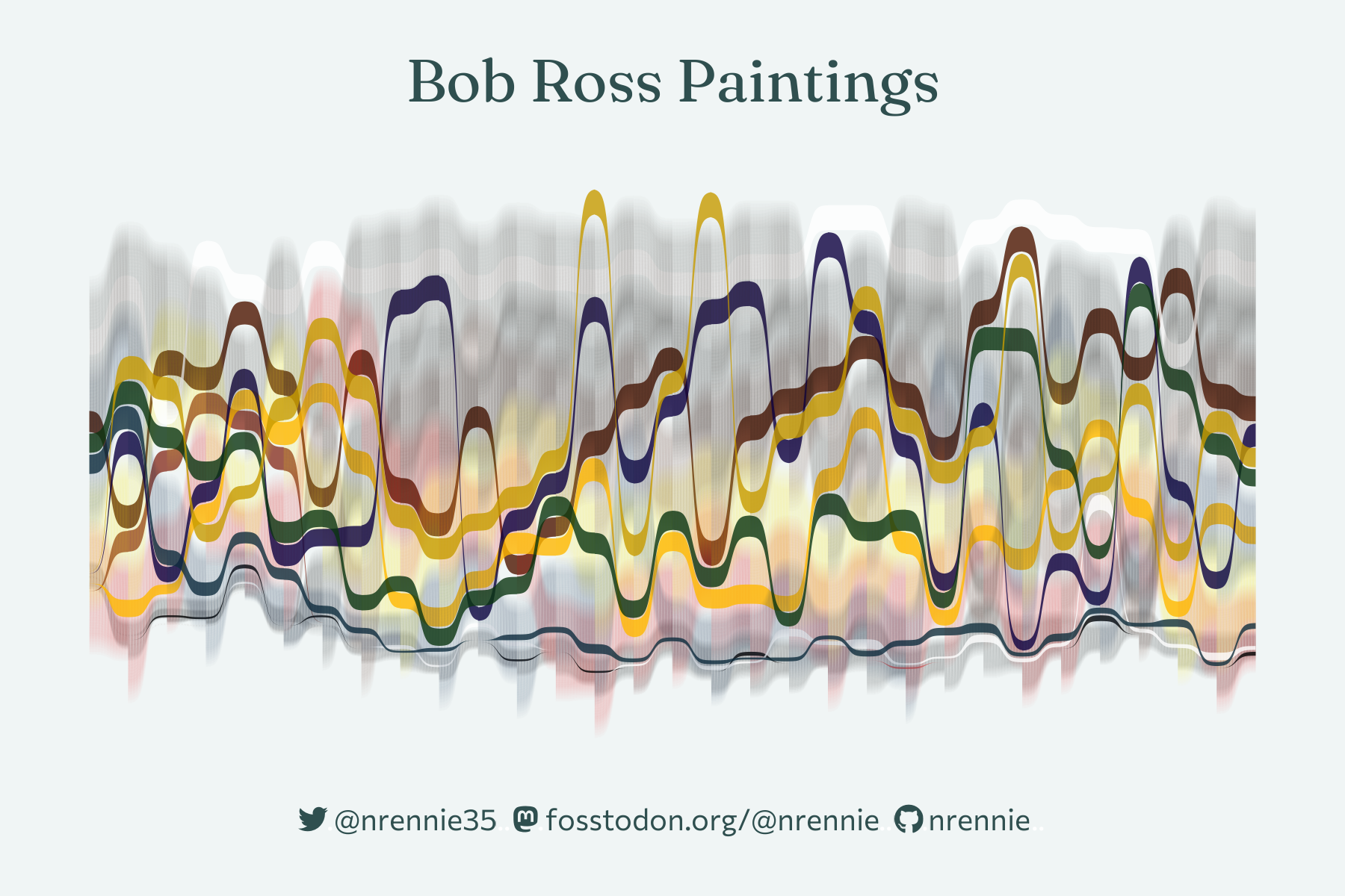
 View projectThe Joy of Painting was a television show created and hosted by painter Bob Ross which taught techniques for creating landscape oil paintings. The show ran from 1983 1994 and, during that time, 403...
 -
 View project**The context:** Imagine for a moment that you are still a teenager and an artist came to your school to build a project with you and your classmates. That is what “Planea” is enabling. Planea...
 -
 View projectUnseen, our plasticising planet Microplastics are much closer to us than we thought. According to the scientific journal, the global average weekly intake of microplastics per person is almost...
 -
 View projectThis is a four-part data visualization series illuminating the narrative intricacies within Raven Kennedy's adult fantasy romance series, "The Plated Prisoner." The books are a reimagination of the...
 -
 View projectThe Marvel Cinematic Universe (MCU) is the highest-grossing film franchise of all time, but until recently, the characters it depicts on screen did not reflect the diversity right outside our...
 -
 View projectPentobarbital is frequently utilized for euthanasia. Unexpectedly, it has also led to a series of events related to secondary poisoning across multiple species because of its challenging...
 -
 View project'What's in a Title?' is an exploration into the repetitiveness and patterns present within Fantasy Romance book titles. Using 760 book titles from Goodreads' Fantasy Romance genre as a foundation,...
 -
 View projectMotivation. As an artist, I have always been fascinated by the use of color. My favorite artistic medium has always been acrylic, due to the vivid and vibrant colors it is able to depict. I...
 -
 View projectThe study focuses on investigating the correlation between the positioning of water dispensers and their usage patterns. Through careful observation and data analysis, the research aims to discern...
 -
 View projectOne of Batman's most iconic stories is a year-long mystery with murders occurring on on major holidays. This visual walks the reader through the story in a circular calender, the inner bars...
 -
 View project"Praise Be" examines the usage frequency of common expressions found within "The Handmaid's Tale," as documented on Fandom.com. Within this dystopian realm, these devout utterances serve a dual...
 -
 View projectIn 2022, my love for books was rekindled. While reading remained a constant in my life, this year marked my entry into the vibrant Bookstagram community, enabling me to share my literary enthusiasm...
 -
 View projectBeautiful Music features sixes pieces of music which are each remarkable compositions in their own way. Visualising the notes shines a light on the different elements of each piece. Through...
 -
 View projectTrop is the trend-focused nucleus for Latin America within the Consumoteca Group. In Trop's perspective, everyone is both a creator and a follower of trends, and the hierarchy between center and...