
"Woven Secrets," part of the Design Signals program, investigates the evolution of Romania’s textile industry through a multidisciplinary exhibition that uses data visualization as a core tool to...
-
 View projectStep into the vibrant world of Eurovision with this data-driven piece - where every flag tells a story, and every bar represents a nation's voice in the ultimate musical showdown. Each country’s...
 -
 View projectTaylor Swift’s Eras tour left an indelible mark on the cultural and economic landscape of 2024. According to the New York Times, over the course of 21 months and 149 shows, the tour boasted over...
 -
 View projectUsing an exclusive dataset of 1.7 million car listings, this interactive reveals how vehicle colors went from a rainbow of options to a sea of gray. To assemble our database, we looked at all car...
 -
 View projectInspired by CIRCADIAN DREAMS from @uchronia.world, the project expands on the concept of clock time and circadian rhythms to reflect on the entire trajectory of a person’s life, emphasizing the ups...
 -
 View projectCommit is a series of visualization and sonification works based on GitHub commit history. By analyzing developers' code commit data on GitHub, the work uses data-driven generation to generate...
 -
 View projectThe project 'Talaas: A Data-Driven Visualisation into Bharatnatyam Rhythms' uses data visualisation to explain rhythmic patterns engagingly. It starts by introducing Talas, their origins, and their...
 -
 View projectBringing the rhythm of Hamilton to life through data, this visualisation transforms the show’s vocal dynamics into striking waveforms. Inspired by the sine waves that carry sound, each song takes...
 -
 View projectDexter Morgan, everyone's favorite blood spatter analyst and serial killer, captivated audiences throughout his run on Showtime (until the controversial finale, that is). The show’s masterful blend...
 -
 View projectUsing an exclusive dataset of 1.7 million car listings, this interactive reveals the most uniquely popular vehicle models in locales across the U.S. The analysis is based on how much a vehicle’s...
 -
 View project"Constellations" is a research project, inaugurated in 2024 by the FANGOR Foundation, in the form of an interactive Map visualising the chronology of life and artistic activity of Polish spatial...
 -
 View projectThe project is to explain the nationwide phenomenon of wearing ancient Chinese clothing "Hanfu" as daily clothing. Through a combination of text, visuals, charts, illustrations, and diagrams,...
 -
 View projectThe Data Designer is a mobile-first interactive survey developed by Munus Shih, Richard Lehmann, Allison Connell and Matt Owen of Athletics. It allows the user to create bespoke animated data...
 -
 View projectThis visualization explores the language of color in two transformative periods of art history: the Renaissance and the Modernism era. Separated by centuries but sharing a profound devotion to...
 -
 View projectThis visualisation represents the letters exchanges between Van Gogh and his brother between 1880 and 1890. While the topics were quite diverses I focus on the top 3 topics described on these...
 -
 View projectMaps of Paintings is an experimental mapping project commissioned by the National Gallery in London to allow visitors to join in celebrating the National Gallery’s 200th anniversary of connecting...
 -
 View projectThese miso jars transform recipe data into pottery itself. Each element of the material and form communicates: - Red clay on the lids maps fermentation time (1 circle = 1 year). - Tan clay...
 -
 View projectThe intention of this project is to choose a relevant and interesting story and narrate it using maps, through a combination of storytelling, cartography and visual design. This project explores...
 -
 View project35 color palettes by Blake Robert Mills, inspired by works from the Museum of Modern Art in New York. I've visualized the color palettes in voronoi charts as if they were their own pieces of art on...
 -
 View projectRadical Accounting: Alvin Ailey American Dance Theater’s Data as a Framework for Historical Imagination consists of three time-based interventions that were presented in the gallery as part of the...
 -
 View projectThis project showcases a popular Japanese food show, Kodoku No Gurume (Solitary Gourmet) and its 12 seasons.
 -
 View projectThe work "IMDB Top Movies" presents the highest-rated movies from imdb.com. It examines movies with a rating of 7.5 or higher, which received 50,000+ votes. In total, just over 1000 films are...
 -
 View projectDelhi, the capital of India, is a vibrant and diverse metropolis that has a rich cultural heritage. Its culture is a beautiful blend of historic traditions, modern influences, and a melting pot of...
 -
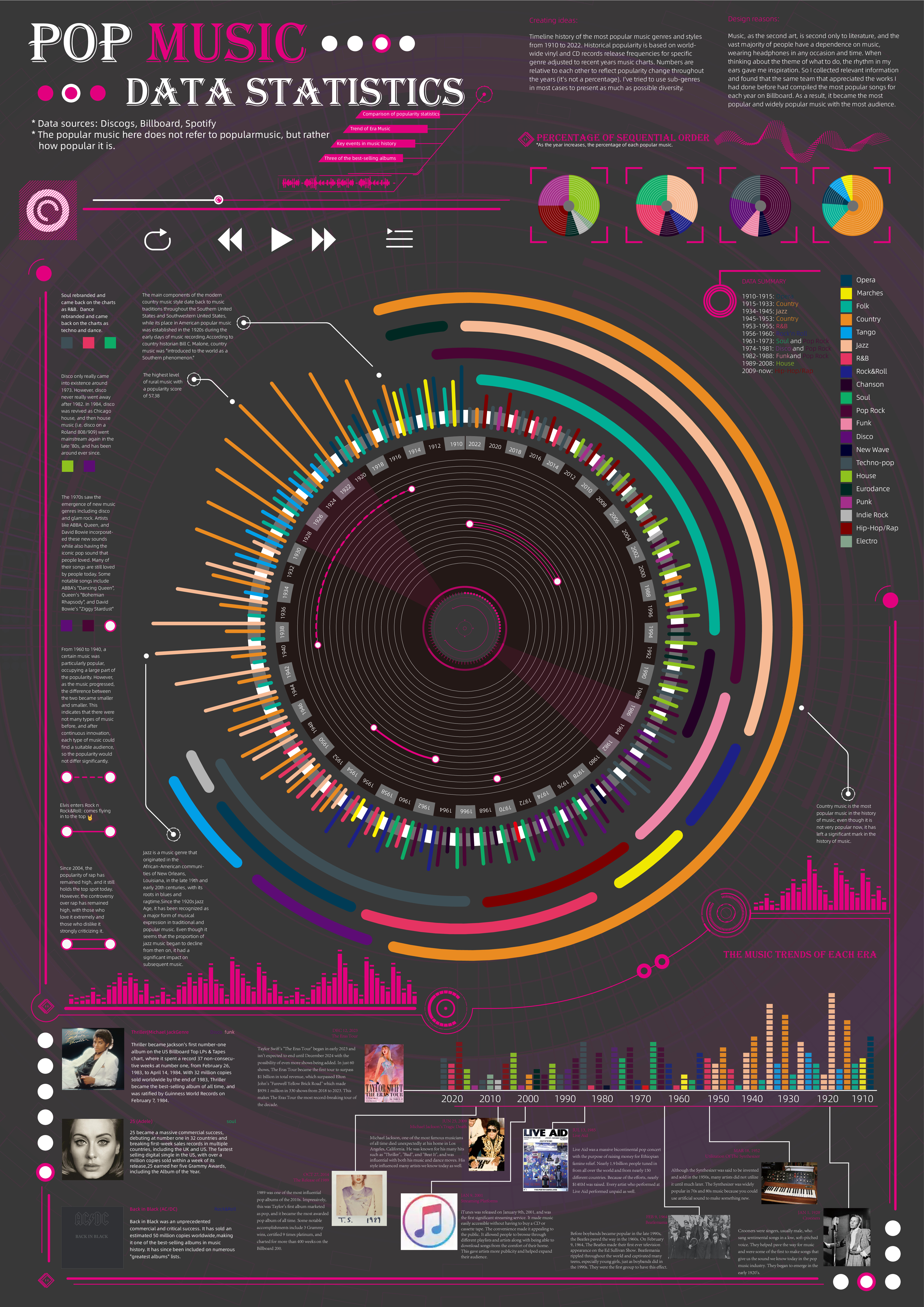
 View projectTimeline history of the most popular music genres and stylesfrom 1910 to 2022.Historical popularityis based on world-wide vinyl and CD records release frequencies for specificgenre adjusted to...
 -
 View projectA calendar poster created with Tropical Zodiac ephemeris data and a custom Adobe Illustrator script displaying the zodiacal positions of the Sun, Moon, Mercury, Venus, Mars, Jupiter, Saturn,...
 -
 View projectA hand-knit pair of socks is a luxury in an age of fast fashion and mass consumption. Amongst knitters, socks have a reputation for being difficult - the 3D shape of the heel turn sounds...
 -
 View projectThe Jewish Timeline is an interactive experience that presents key events in Jewish history across three main axes: Culture & Creation, Major Events, and Lifestyle. The timeline offers a...
 -
 View projectThe Beijing Central Axis is an urban axis stretching 7.8 kilometers in length. Architect Liang Sicheng once highly praised it as "the longest and greatest north-south central axis in the world,"...

